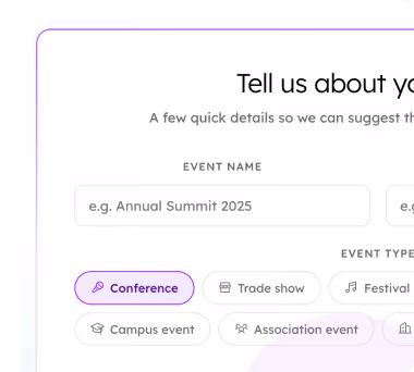
A Smaller School?
Deliver a polished, branded event experience without a large team or a big budget.

A Smaller School?
Deliver a polished, branded event experience without a large team or a big budget.
Running Family Programs?
Give families everything they need, from schedules and maps to real-time updates, all in one place.

Running Family Programs?
Give families everything they need, from schedules and maps to real-time updates, all in one place.
Coordinating Move-In Day?
Share updates, manage events, and keep students informed from move-in through the academic year.

Coordinating Move-In Day?
Share updates, manage events, and keep students informed from move-in through the academic year.
Offering Campus Tours?
Deliver branded, self-guided tour experiences with interactive maps and rich media, available 24/7.

Offering Campus Tours?
Deliver branded, self-guided tour experiences with interactive maps and rich media, available 24/7.
Organising a Career Fair?
Simplify logistics for students, employers, and Career Services staff with one easy-to-use app.

Organising a Career Fair?
Simplify logistics for students, employers, and Career Services staff with one easy-to-use app.
Managing Alumni Events?
Plan reunions, regional events, and fundraising campaigns with an app built for alumni engagement.

Managing Alumni Events?
Plan reunions, regional events, and fundraising campaigns with an app built for alumni engagement.
Boost Student Engagement
One hub for schedules, resources, and events that keeps students connected throughout the academic year.

Boost Student Engagement
One hub for schedules, resources, and events that keeps students connected throughout the academic year.
Planning Orientation?
Help new students feel prepared from day one with schedules, campus resources, and real-time updates in one app.

Planning Orientation?
Help new students feel prepared from day one with schedules, campus resources, and real-time updates in one app.
Running Admissions Events?
Manage open houses, tours, and yield events with a branded app that saves time and engages prospective students.

Running Admissions Events?
Manage open houses, tours, and yield events with a branded app that saves time and engages prospective students.
Get a custom Sponsorship Package Template
Stop starting from scratch. Grab free templates that helWe'll build a tailored sponsorship package with suggested pricing, tiers, and benefits..for your specific event.p you build professional sponsorship packages and close deals faster.
Get a custom Sponsorship Package Template
Stop starting from scratch. Grab free templates that helWe'll build a tailored sponsorship package with suggested pricing, tiers, and benefits..for your specific event.p you build professional sponsorship packages and close deals faster.
Plan Your Next Event Without Missing a Beat.
From venue selection to post-event wrap-up, this free checklist walks you through every step (so nothing falls through the cracks).
.avif)
Plan Your Next Event Without Missing a Beat.
From venue selection to post-event wrap-up, this free checklist walks you through every step (so nothing falls through the cracks).
Real Results From Real Events
100,000+ organizations trust Guidebook. See exactly how universities, associations, enterprises, and more put it to work.

Real Results From Real Events
100,000+ organizations trust Guidebook. See exactly how universities, associations, enterprises, and more put it to work.
Flexible pricing for every event size
Find the perfect plan for your needs, from intimate gatherings to large-scale conferences.

Flexible pricing for every event size
Find the perfect plan for your needs, from intimate gatherings to large-scale conferences.
Join our event experts
Watch on-demand webinars and join live sessions with industry leaders sharing best practices for event success.
.avif)
Join our event experts
Watch on-demand webinars and join live sessions with industry leaders sharing best practices for event success.
Guidebook in Action
Book a personalized walkthrough and discover how we help event teams create better attendee experiences.
Guidebook in Action
Book a personalized walkthrough and discover how we help event teams create better attendee experiences.
How to read your melt curve (and what to do about it)
%20(1).avif)


How to read your melt curve (and what to do about it)
- Your melt curve has a shape, and the shape tells you what's causing the loss, not just how much you're losing.
- The four curve shapes (Cliff, Slow Bleed, Late Surge, Flat Line) each call for a different intervention on a different timeline.
- The highest-risk window for most regional comprehensives is the six weeks between May 1 and mid-June, before orientation outreach typically begins.
- Fixing melt isn't about sending more emails. It's about sending the right signal at the moment the curve starts to bend.
- Indiana Tech moved from 40% yield to 82% yield on their Admitted Students Day cohort, a 105% increase, by changing what happened after the deposit, not before it.
It's the second week of May. Deposits are in. You pull up your enrollment data, and on the surface, the numbers look fine. Your deposited count is where it needs to be. Your Director is happy. You exhale.
Then you look at the week-by-week breakdown.
The number that felt solid is moving. Slowly at first. Then faster. By the time you notice the shape of it, six weeks have already gone by and some of those students are halfway to a different decision.
That shape is your melt curve. And learning to read it (not just track it) is the difference between reacting to melt and getting ahead of it. Here's what the four most common shapes look like, what each one is telling you, and what to do once you know which one you're dealing with.
What is a melt curve, and why most admissions teams misread it
Most admissions teams track melt as a final number. You started with 800 deposited students. You enrolled 680. Melt rate: 15%. That number goes into the report, and everyone moves on.
The problem is that the final number tells you how much you lost. It doesn't tell you when you lost them, why, or (most importantly) whether your interventions are working.
Your melt curve is the week-by-week graph of confirmed enrolled students against your total deposited count, plotted from May 1 through move-in. It has a shape. And the shape is where the information lives.
What is a melt curve?
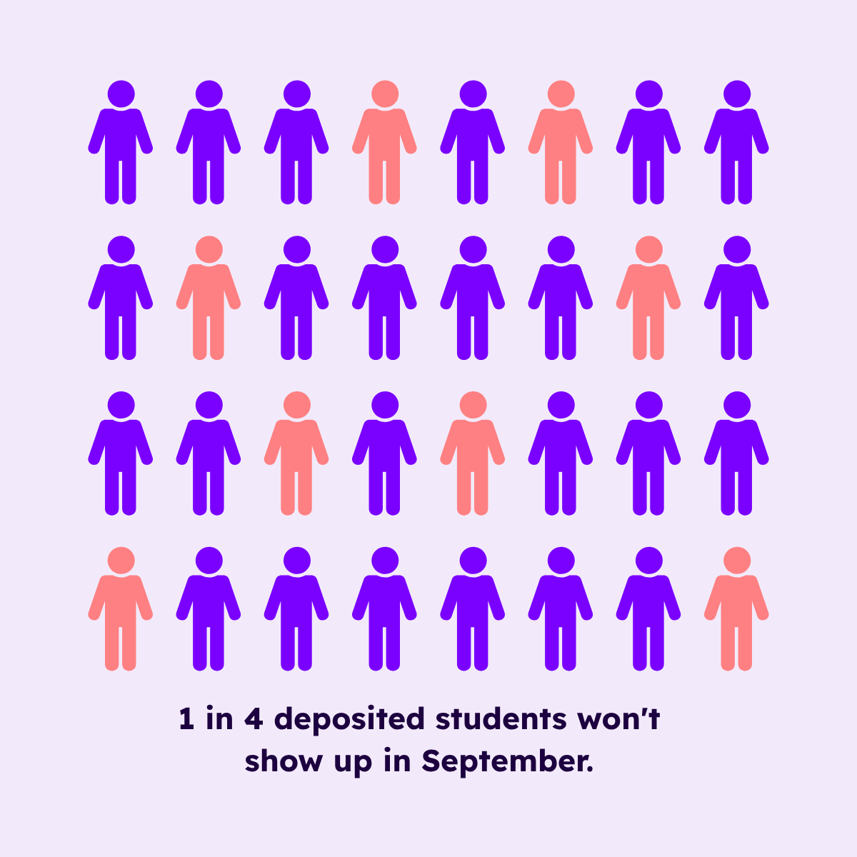
A melt curve is a week-by-week graph of deposited student attrition across the post-deposit window, typically May 1 through the first week of classes. It shows not just total loss but the rate and timing of that loss. National averages put summer melt at 10–40% depending on institution type, with regional comprehensives and first-generation-heavy populations seeing the highest rates. Reading the curve's shape (rather than only its final number) is what allows admissions teams to intervene at the right moment rather than after the loss has already happened.
The four melt shapes, and what each one means
Every melt curve is unique to your institution. But most fall into one of four recognizable shapes. Each shape points to a different cause, and a different response.
The Cliff
A sharp, steep drop concentrated in the first few weeks after May 1. You lose a meaningful slice of your deposited cohort in a short window, then the curve levels off.
What's causing it: A competing offer accepted elsewhere, or a financial aid gap that surfaced when the package arrived. The student made a fast decision, probably in the same week they got your award letter and a better one from somewhere else.
What it calls for: Speed. The Cliff shape doesn't respond to a nurture sequence. By the time your third welcome email lands, they're gone. Your intervention needs to happen within 72 hours of deposit, not 72 days. A personal call from a counselor in the first week post-deposit is worth more than any automated sequence you'll build.
The Slow Bleed
Steady, low-grade attrition across the entire post-deposit window, week over week, from May through August. No single dramatic moment. Just a slow drain.
What's causing it: A belonging and engagement gap. These students deposited but never felt fully connected to the institution. Nobody followed up in a way that felt personal. The emails arrived on schedule but felt like mail merge. By July, another option started feeling more real.
What it calls for: Consistent, human connection points, not a single big event. Many admissions teams describe building their post-deposit communication calendars around what their team can execute, not around when deposited students are most at risk of disengaging. The Slow Bleed shape is what that calendar produces. The fix isn't more volume. It's more signal: moments that say we see you specifically, not hello enrolled student.
The Late Surge
The curve looks healthy through May and June, then accelerates sharply in July and August.
What's causing it: An orientation communication breakdown, or a late-breaking practical barrier (housing confirmation confusion, a financial hold the student didn't know about, a schedule conflict that surfaced when orientation materials arrived). These are solvable problems that became enrollment losses because nobody caught them in time.
What it calls for: A pre-orientation check-in protocol. Before your orientation communications go out, run a quick audit of your deposited cohort: who hasn't confirmed housing? Who has an outstanding hold? Who hasn't opened a single communication in 30 days? The Late Surge is almost always preventable, but only if you're looking for it before July.
The Flat Line
Almost no attrition through the summer, then a sudden cluster of withdrawals in the final two to four weeks before move-in.
What's causing it: Late-breaking financial or family barriers, most commonly in first-generation populations. These students were committed. Then something changed: a parent lost a job, a sibling's tuition came due, a family conversation happened in August that didn't happen in May. The decision wasn't slow. It was fast and it was late.
What it calls for: Proactive one-to-one outreach in the final 30 days before move-in, specifically targeted at your highest-risk cohort. If you know your deposited class has a significant first-generation population, the Flat Line shape is your baseline risk. Don't wait for withdrawals to trigger outreach. Build the 30-day check-in into the calendar before August starts.
How to read your own curve in three steps
You don't need a research team or a data analyst to do this. You need a spreadsheet and two cycles of post-deposit enrollment data.
Step 1: Pull your confirmed enrolled count by week, not month, for the past two cycles. Most SIS platforms can generate this in under ten minutes. If yours can't, export the raw data and build a simple week-number column.
Step 2: Plot confirmed enrolled against total deposited for the same periods. Add a second layer: mark your communication send dates on the same graph. Every email campaign, every event invite, every financial aid reminder, put it on the timeline.
Step 3: Look at where the curve bends, and what was happening, or not happening, in your communication calendar that same week.
Picture a specific Tuesday in the second week of June. Two counselors, a laptop, a shared spreadsheet. They're looking at last year's curve for the first time as a shape rather than a number. The drop starts in week three. They scroll back to their send history. There's nothing in week two. Nothing in week three. The next communication didn't go out until week five. The Slow Bleed they've been reporting for two years has a cause, and it's sitting right there in the gap between sends.
That moment (recognizing the shape) is where the intervention gets designed.
What to do once you know your shape
Knowing your curve shape doesn't automatically fix melt. But it tells you exactly where to put the effort, and where not to.
Andrea Crilly, Assistant Director of Admissions for Campus Experience at Indiana Tech, has watched the curve shift over nearly a decade. "Our yield grew tremendously once we began using Guidebook," she said. "When we started in 2015, we yielded 40%. After implementing Guidebook in 2020, that number grew to 60–72%, and in 2022 and 2023 it increased to 82%. We believe Guidebook had a strong impact on that growth."
That progression (40% to 60–72% to 82%) isn't a single intervention. It's a compounding series of improvements to what happened after the deposit: how students experienced their Admitted Students Day, how they stayed connected through the summer, how the institution showed up on the device they were actually using. Indiana Tech's yield increase maps to the shape-by-shape logic above: better early engagement (Cliff), more consistent connection (Slow Bleed), a more personalized event experience (Late Surge).
The full Indiana Tech story is worth reading if you're working on your Admitted Students Day program: it's here.
For each curve shape, your starting point is the same: identify which shape you're dealing with, map your current communication calendar against it, and find the gap. The gap is almost always earlier than you think.
The three mistakes that flatten the wrong parts of the curve
Admissions teams that work hard on melt prevention and still see high attrition are usually making one of these three errors.
Starting interventions after orientation begins. By the time your orientation communications go out, the Cliff and Slow Bleed windows have already closed. A common pattern is that by the time a team recognizes its Slow Bleed shape, orientation week is four weeks away, too late to course-correct for the students already halfway out the door. Your melt interventions need to begin in May, not July.
Treating all deposited students as one cohort. Your first-generation students, your commuter students, and your out-of-state students have different curve shapes. A single communication calendar built for the average deposited student will underserve all three. Segment by risk factor (financial aid dependency, distance from campus, first-gen status), and calibrate your outreach cadence accordingly.
Measuring success by total melt rate rather than curve shift. If your overall melt rate goes from 18% to 16%, that's progress, but it may be masking the fact that your Cliff shape got worse while your Slow Bleed improved. Track the shape across cycles, not just the headline number. A curve that's shifting earlier and flattening is a curve that's responding to intervention, even if the final number hasn't moved dramatically yet.
What success looks like: your melt curve in 12 months
Your melt curve doesn't disappear. That's not the goal. The goal is for it to change shape.
A Cliff becomes a Slow Bleed when your early outreach is working. A Slow Bleed becomes a Flat Line (with a small, manageable late bump) when your sustained connection program is running well. That progression is the signal. It means the interventions are landing at the right moments, not just filling inbox quotas.
For your two-person admissions team, success looks like this: it's the second week of September. Your enrolled class is on campus. You pull up this year's curve next to last year's. The drop in week three is smaller. The late-August cluster is gone. You have a number for your Director that's better than last year, and you know exactly which intervention moved it.
That's the conversation that matters. Not features, not platforms, not automation sequences. The conversation about which week the curve started bending the right way, and why.
Read the curve. Fix the right thing.
The shape of the fix is the same across all four curves: one app for every moment that matters, a single connected experience that holds every touchpoint of the summer in one place, on the device admitted students actually use. To see how other admissions teams are building their post-deposit programs, visit the Admissions & Enrollment page.
[faq]
Q: What is a melt curve in higher education admissions?
A: A melt curve is a week-by-week graph of deposited student attrition across the post-deposit window, typically May 1 through the first week of classes. It shows not just how many students you lost, but when you lost them and at what rate. National averages put summer melt at 10–40% depending on institution type. Reading the shape of the curve (rather than only the final number) is what allows admissions teams to identify the cause of loss and intervene at the right moment.
Q: When does summer melt typically happen for deposited students?
A: It depends on your curve shape. Some institutions see the sharpest losses in the first two to three weeks after May 1, usually tied to financial aid decisions or competing offers. Others see steady attrition across the full summer window. Late-surging institutions lose the most students in July and August, often due to orientation communication gaps or unresolved holds. Tracking attrition by week, not by month or season, is what reveals the timing.
Q: What causes the Cliff shape in a melt curve?
A: The Cliff (a sharp drop concentrated in the first few weeks post-deposit) is most commonly caused by a competing offer accepted elsewhere or a financial aid gap that surfaced when the award letter arrived. The student made a fast decision, often within days of receiving their package. Institutions that see this shape consistently benefit most from personal outreach in the first week post-deposit, before the competing offer has time to become a commitment.
Q: How do I know if my post-deposit communication is working?
A: Plot your communication send dates on the same graph as your melt curve. If your curve flattens or slows in the weeks immediately following a communication touchpoint, that's a signal the outreach is landing. If the curve continues its slope regardless of send cadence, the volume may be right but the content or channel isn't connecting. The goal isn't to eliminate attrition entirely. It's to see the curve shifting earlier and flattening across successive cycles.
Q: What's the difference between melt rate and melt shape?
A: Melt rate is the final number: the percentage of deposited students who didn't enroll. Melt shape is the week-by-week pattern of how that loss happened. Two institutions can have identical melt rates but completely different shapes, which means completely different causes and completely different interventions. A 15% melt rate driven by a Cliff needs a completely different response than a 15% melt rate driven by a Slow Bleed. Tracking shape across cycles is what builds genuine institutional knowledge about your deposited population.
Q: How early should admissions teams start melt prevention?
A: Earlier than most do. The highest-risk window for Cliff-shape institutions opens on May 1, the day deposits are confirmed. For Slow Bleed institutions, the risk is distributed across the full summer but the compounding effect means every week of inaction costs more than the week before. A good working rule: your first post-deposit outreach should go out within five business days of deposit confirmation, not five weeks.
Q: Do first-generation students melt at higher rates?
A: Research consistently shows that first-generation students are among the highest-risk populations for summer melt, alongside students at regional comprehensives and those with significant financial aid dependency. The reasons are practical as much as emotional: late-breaking financial barriers, family obligations that emerge over the summer, and less familiarity with what the pre-arrival process requires of them. First-generation students are also more likely to show the Flat Line shape, where attrition clusters in the final 30 days before move-in rather than spreading across the summer.
[/faq]
Plan with Confidence, Not stress
Get the complete event planning checklist with pre-event prep, day-of setup, and post-event follow-up all in one place..


.png)