A Smaller School?
Deliver a polished, branded event experience without a large team or a big budget.
A Smaller School?
Deliver a polished, branded event experience without a large team or a big budget.
Running Family Programs?
Give families everything they need, from schedules and maps to real-time updates, all in one place.
Running Family Programs?
Give families everything they need, from schedules and maps to real-time updates, all in one place.
Coordinating Move-In Day?
Share updates, manage events, and keep students informed from move-in through the academic year.

Coordinating Move-In Day?
Share updates, manage events, and keep students informed from move-in through the academic year.
Offering Campus Tours?
Deliver branded, self-guided tour experiences with interactive maps and rich media, available 24/7.

Offering Campus Tours?
Deliver branded, self-guided tour experiences with interactive maps and rich media, available 24/7.
Organising a Career Fair?
Simplify logistics for students, employers, and Career Services staff with one easy-to-use app.
Organising a Career Fair?
Simplify logistics for students, employers, and Career Services staff with one easy-to-use app.
Managing Alumni Events?
Plan reunions, regional events, and fundraising campaigns with an app built for alumni engagement.
Managing Alumni Events?
Plan reunions, regional events, and fundraising campaigns with an app built for alumni engagement.
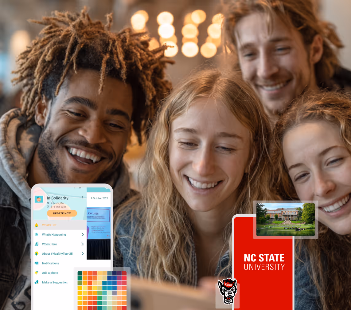
Boost Student Engagement
One hub for schedules, resources, and events that keeps students connected throughout the academic year.
Boost Student Engagement
One hub for schedules, resources, and events that keeps students connected throughout the academic year.
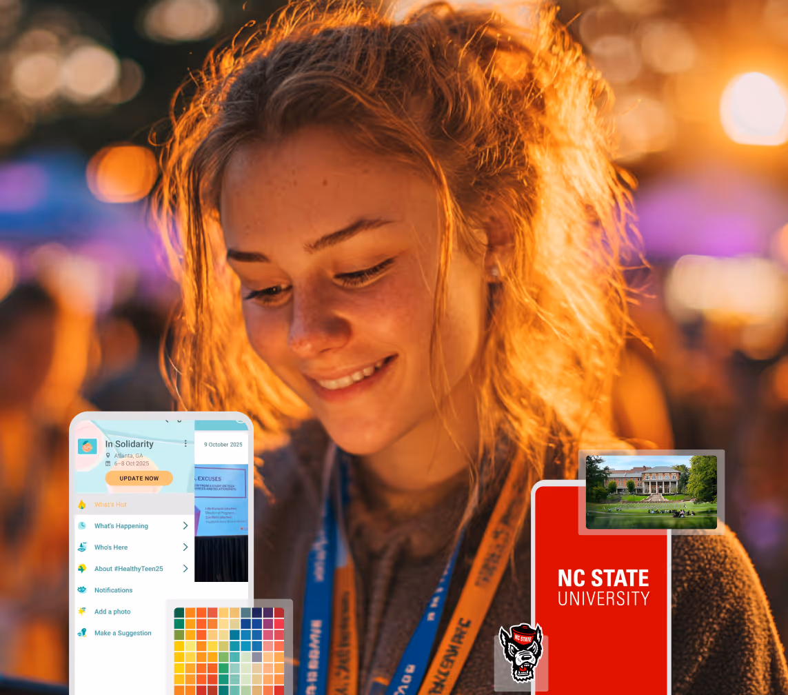
Planning Orientation?
Help new students feel prepared from day one with schedules, campus resources, and real-time updates in one app.
Planning Orientation?
Help new students feel prepared from day one with schedules, campus resources, and real-time updates in one app.
Running Admissions Events?
Manage open houses, tours, and yield events with a branded app that saves time and engages prospective students.

Running Admissions Events?
Manage open houses, tours, and yield events with a branded app that saves time and engages prospective students.
Get a custom Sponsorship Package Template
Stop starting from scratch. Grab free templates that helWe'll build a tailored sponsorship package with suggested pricing, tiers, and benefits..for your specific event.p you build professional sponsorship packages and close deals faster.
Get a custom Sponsorship Package Template
Stop starting from scratch. Grab free templates that helWe'll build a tailored sponsorship package with suggested pricing, tiers, and benefits..for your specific event.p you build professional sponsorship packages and close deals faster.
Plan Your Next Event Without Missing a Beat.
From venue selection to post-event wrap-up, this free checklist walks you through every step (so nothing falls through the cracks).
.avif)
Plan Your Next Event Without Missing a Beat.
From venue selection to post-event wrap-up, this free checklist walks you through every step (so nothing falls through the cracks).
Real Results From Real Events
100,000+ organizations trust Guidebook. See exactly how universities, associations, enterprises, and more put it to work.

Real Results From Real Events
100,000+ organizations trust Guidebook. See exactly how universities, associations, enterprises, and more put it to work.
Flexible pricing for every event size
Find the perfect plan for your needs, from intimate gatherings to large-scale conferences.

Flexible pricing for every event size
Find the perfect plan for your needs, from intimate gatherings to large-scale conferences.
Join our event experts
Watch on-demand webinars and join live sessions with industry leaders sharing best practices for event success.
.avif)
Join our event experts
Watch on-demand webinars and join live sessions with industry leaders sharing best practices for event success.
Guidebook in Action
Book a personalized walkthrough and discover how we help event teams create better attendee experiences.
Guidebook in Action
Book a personalized walkthrough and discover how we help event teams create better attendee experiences.
New Release: Updated app layouts on iOS


New Release: Updated app layouts on iOS
What’s changing:
Users of our apps for iPhone will now see a newer, more modern layout. Instead of the grid of square icons on the home screen, with each icon taking the user into a different section of the app, users will now see guide content on the home screen. A “hamburger menu” in the upper right corner of the screen will slide out and provide access to the app’s different sections (schedule, maps, social media, etc.).
Why did we change it:
In the past, users were most familiar with the navigation on the home screen of an iPhone or iPad, so we wanted to mirror that design in our apps so that there wouldn’t be a steep learning curve. This is why we went with a grid of square icons as our preferred navigation.
But times have changed, and many of the most innovative and popular iOS apps including Uber, Google Maps, and Facebook now offer navigation through a slide out menu. This means that users are more familiar with that style of navigation, and it will be easier to use. It also allows you to get from section to section with fewer clicks.
The other nice benefit of the change is that the navigation is now consistent across iOS, Android, and the web. Now it’ll be easier than ever for users to assist each other regardless of device.Plan with Confidence, Not stress
Get the complete event planning checklist with pre-event prep, day-of setup, and post-event follow-up all in one place..


.avif)