A Smaller School?
Deliver a polished, branded event experience without a large team or a big budget.
Running Family Programs?
Give families everything they need, from schedules and maps to real-time updates, all in one place.
Coordinating Move-In Day?
Share updates, manage events, and keep students informed from move-in through the academic year.

Offering Campus Tours?
Deliver branded, self-guided tour experiences with interactive maps and rich media, available 24/7.

Organising a Career Fair?
Simplify logistics for students, employers, and Career Services staff with one easy-to-use app.

Managing Alumni Events?
Plan reunions, regional events, and fundraising campaigns with an app built for alumni engagement.
Boost Student Engagement
One hub for schedules, resources, and events that keeps students connected throughout the academic year.
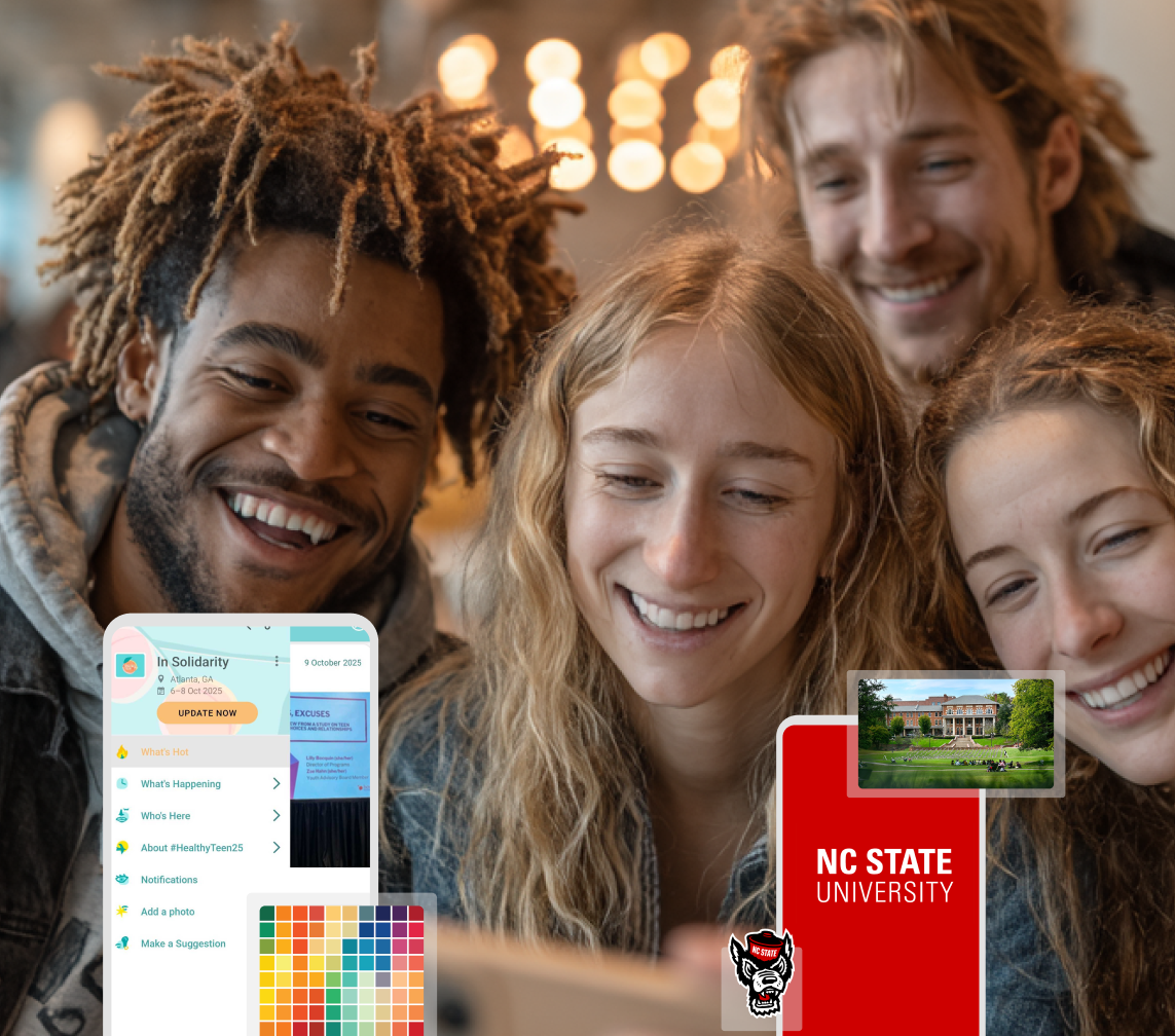
Planning Orientation?
Help new students feel prepared from day one with schedules, campus resources, and real-time updates in one app.
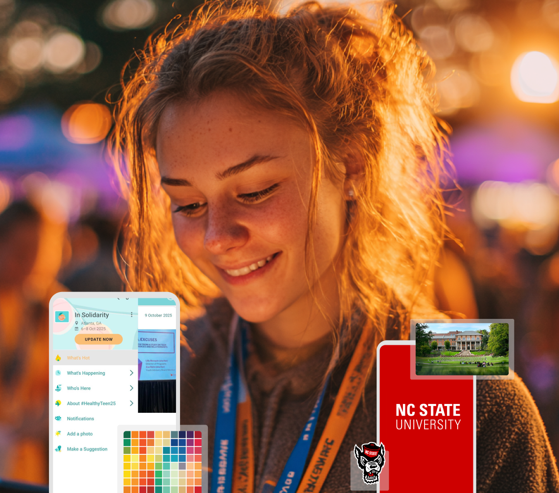
Running Admissions Events?
Manage open houses, tours, and yield events with a branded app that saves time and engages prospective students.

5 Ready-to-Use Sponsorship Package Templates
Stop starting from scratch. Grab free templates that help you build professional sponsorship packages and close deals faster.

Plan Your Next Event Without Missing a Beat.
From venue selection to post-event wrap-up, this free checklist walks you through every step (so nothing falls through the cracks).
.png)
Real Results From Real Events
100,000+ organizations trust Guidebook. See exactly how universities, associations, enterprises, and more put it to work.

Flexible pricing for every event size
Find the perfect plan for your needs, from intimate gatherings to large-scale conferences.

Join our event experts
Watch on-demand webinars and join live sessions with industry leaders sharing best practices for event success.
.jpeg)
Guidebook in Action
Book a personalized walkthrough and discover how we help event teams create better attendee experiences.

7 Best Practices to Create a High-Converting Event Registration Landing Page

7 Best Practices to Create a High-Converting Event Registration Landing Page
You’ve spent months planning your event and now it’s time to share it with the world so you can start collecting registrations.
But is your registration page optimized to convert? Does it clearly communicate the value of your event and make it easy for attendees to sign up?
Even “small” missteps like a buried CTA, a clunky form, or confusing ticket options can cause potential attendees to drop off in the middle of registration.
So in this guide, we’ve rounded up 7 essential strategies to help you create an event registration landing page that’s clear, compelling, and built to drive sign-ups. Whether you’re planning a conference, college orientation, or a networking event, these best practices will help you reduce drop-offs and increase attendance.
What is an Event Registration Landing Page?
An event registration landing page is a dedicated web page designed to capture sign-ups for an upcoming event. This is where attendees choose their ticket type, enter their contact information, and complete the registration process.
Because this page is focused on conversion, it needs to be:
- Clear and distraction-free.
- Optimized for mobile.
- Focused on helping users quickly select their ticket and confirm registration.
7 Best Practices for Designing a High-Converting Event Registration Page
1. Keep the form simple
A cluttered or overly complicated form can deter users from completing their registration. Streamline the process by:
- Asking for essential information only (such as name, email, job title, etc.). If you're unsure which fields to include, here’s a guide on what to include in an event registration form. Also, keep in mind that you can use advanced forms with conditional logic, allowing you to show fields based on a user's previous answers.
- Using drop-down menus to simplify data entry.
- Enabling autofill so the user’s browser can automatically populate common fields.
- Displaying error messages in real-time to help users correct mistakes.
A simple, user-friendly form increases the likelihood of conversions and reduces abandonment rates.
2. Highlight key event details
Your online registration page should always remind future attendees about the what, when, where, and why of your event. This helps reassure them that they are, in fact, in the right place. To accomplish this, your page should include:
- A headline describing the expected user action, such as “Register,” “Buy Tickets,” “Reserve Your Spot Today.”
- The event name.
- A short event description (optional).
- The date and time of the event.
- The event location: if virtual, specify the platform and if in-person, include the city and state (optional: venue name and address).
Keeping this information front and center —ideally, placing it above the fold — builds trust and helps visitors commit faster.
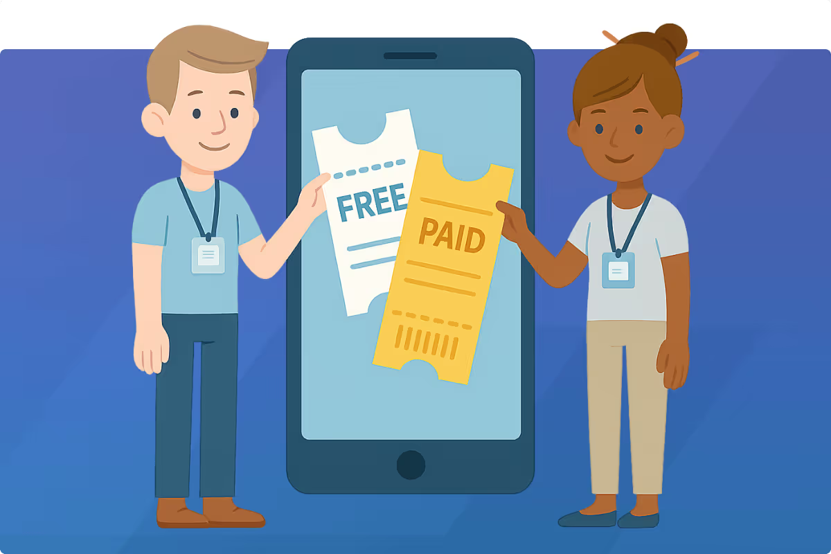
3. Clearly showcase ticket tiers
Maybe you're hosting a free event with a paid VIP upgrade. Or, perhaps your event is paid and includes multiple tiers with different levels of access.
Either way, your page should clearly distinguish all available tiers so that users can easily choose the one that matches their needs and budget. Some common ticket options to consider for your event include:
- Early Bird Discounts: Encourage early registrations with special pricing.
- General Admission: Define standard entry options and pricing.
- VIP Passes: Highlight perks like exclusive access or premium seating.
- Group Rates: Offer discounts for teams or group registrations.
4. Include a clear call-to-action (CTA)
Your CTA should be easy to spot when scanning the page and it should be action-oriented. Use clear, persuasive language like:
- “Register Now”
- “Order Now”
- "Reserve Your Spot Today"
To ensure that the button stands out, use a bold color that isn’t used anywhere else on the page.
5. Optimize for mobile devices
With more people managing all aspects of their life via smartphones, mobile optimization is non-negotiable. So, before announcing registration, take the time to ensure that users will have a smooth experience on mobile devices.
Pay particular attention to:
- Responsive Design: The registration page layout should adjust to various screen sizes.
- CTA Accessibility: Buttons and links should be large enough to tap easily without zooming.
- Form Usability: Forms should be easy to fill out, with drop-down menus, autofill features, and minimal typing required.
- Page Speed: Optimize images and scripts to ensure quick loading times.
- Secure Payment Integration: If payment is required, make sure the checkout process is streamlined and secure on mobile.
6. Add urgency to boost registration
Creating a sense of urgency can encourage visitors to register immediately. Use strategies such as:
- Real-Time Registration Numbers: Show how many people have already registered to highlight the event’s popularity.
- Countdown Timers: Display the time remaining for early bird discounts and other special ticket categories. And if you want to capture interest before tickets even go live, consider implementing a pre‑registration strategy.
- Limited Capacity Messaging: Use phrases like "Only 20 spots left!" to create urgency and FOMO (fear of missing out).
When done effectively, urgency is a great tool for boosting conversions because it motivates users to act quickly.
7. Use progress indicators to improve completion rates
If your registration form has multiple steps, a progress indicator can help keep users engaged and prevent drop-offs. You can implement this by simply displaying a step-by-step progress bar (e.g. "Step 1 of 3") to show users where they are in the process. When users know how many steps remain in the registration process, they are less likely to feel frustrated (a feeling that can dampen their enthusiasm before your event begins).
Note: If you're wondering what all of these best practices look like in the real world, check out our roundup of event registration page examples.
FAQs About Event Registration Landing Pages
How do I increase conversions on my event registration page?
Keep your form short, use a CTA that stands out, and remove anything that distracts from the main goal (getting people to register). You can also experiment with urgency (like countdown timers), testimonials from a previous event, and A/B testing page copy or CTA copy.
Should I use a single-page or multi-step registration form?
Single-page forms are fast and often work best for short, free events or RSVP-style sign-ups. But if you’re gathering more detailed attendee info, selling multiple ticket types, or offering add-ons, a multi-step form can prevent overwhelm and reduce form abandonment. Just be sure to include a progress bar so that users know where they are in the process.
How can I make my landing page mobile-friendly?
“Design for thumbs, not mice” is the best UX advice we’ve come across (and it’s never failed us). That means:
- responsive layouts.
- large tappable buttons.
- minimal text input.
- dropdowns and autofill (to speed up.
Also, it’s a good idea to test load speed. Heavy images and complex scripts might look great on desktop but can slow things down on mobile. So triple check the mobile experience and get rid of anything that hinders performance.
What’s the best CTA for an event registration page?
The best CTA is one that’s clear, action-oriented, and impossible to miss. “Register Now,” “Save My Seat,” and “Claim Your Spot” all work well. The key is making the CTA button visually pops on the screen and the copy doesn’t create any ambiguity for the user.
In Summary: Setup Your Page (and Event) for Success
By focusing on a clean layout, clear CTAs, tiered ticket options, mobile optimization, and a touch of urgency, you’ll be well on your way to having a registration page that turns casual visitors into committed attendees.
And of course, great strategy works even better with great tools. Guidebook’s event registration platform makes it easy to build beautiful, high-converting pages without the hassle. You can customize your form, offer multiple ticket types, collect attendee data, and integrate your registration data with your event app, all in one place.
Start building your own branded registration flow for free today.
Plan with Confidence, Not stress
Get the complete event planning checklist with pre-event prep, day-of setup, and post-event follow-up all in one place..
.png)
.avif)

