A Smaller School?
Deliver a polished, branded event experience without a large team or a big budget.
A Smaller School?
Deliver a polished, branded event experience without a large team or a big budget.
Running Family Programs?
Give families everything they need, from schedules and maps to real-time updates, all in one place.
Running Family Programs?
Give families everything they need, from schedules and maps to real-time updates, all in one place.
Coordinating Move-In Day?
Share updates, manage events, and keep students informed from move-in through the academic year.

Coordinating Move-In Day?
Share updates, manage events, and keep students informed from move-in through the academic year.
Offering Campus Tours?
Deliver branded, self-guided tour experiences with interactive maps and rich media, available 24/7.

Offering Campus Tours?
Deliver branded, self-guided tour experiences with interactive maps and rich media, available 24/7.
Organising a Career Fair?
Simplify logistics for students, employers, and Career Services staff with one easy-to-use app.
Organising a Career Fair?
Simplify logistics for students, employers, and Career Services staff with one easy-to-use app.
Managing Alumni Events?
Plan reunions, regional events, and fundraising campaigns with an app built for alumni engagement.
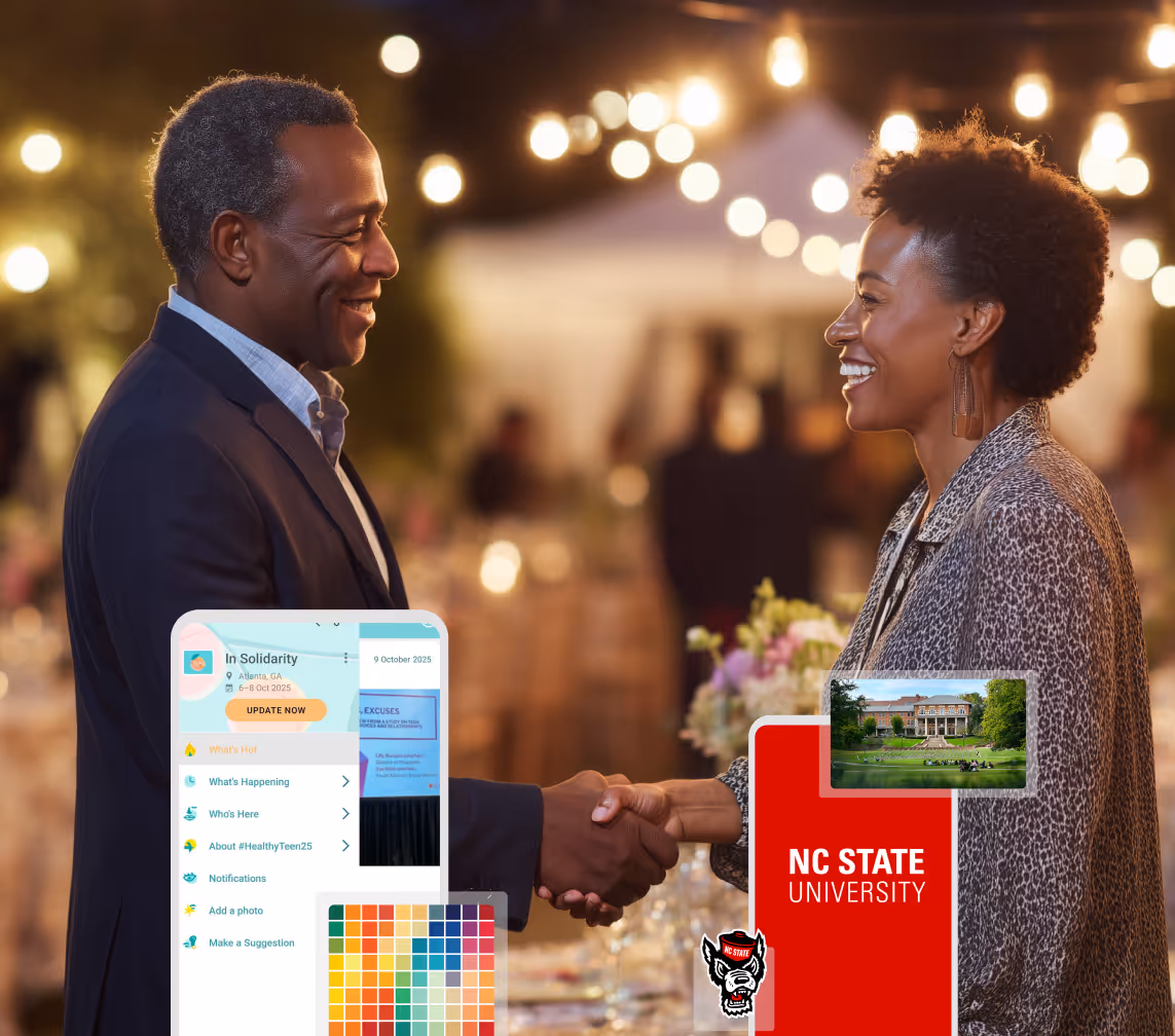
Managing Alumni Events?
Plan reunions, regional events, and fundraising campaigns with an app built for alumni engagement.
Boost Student Engagement
One hub for schedules, resources, and events that keeps students connected throughout the academic year.
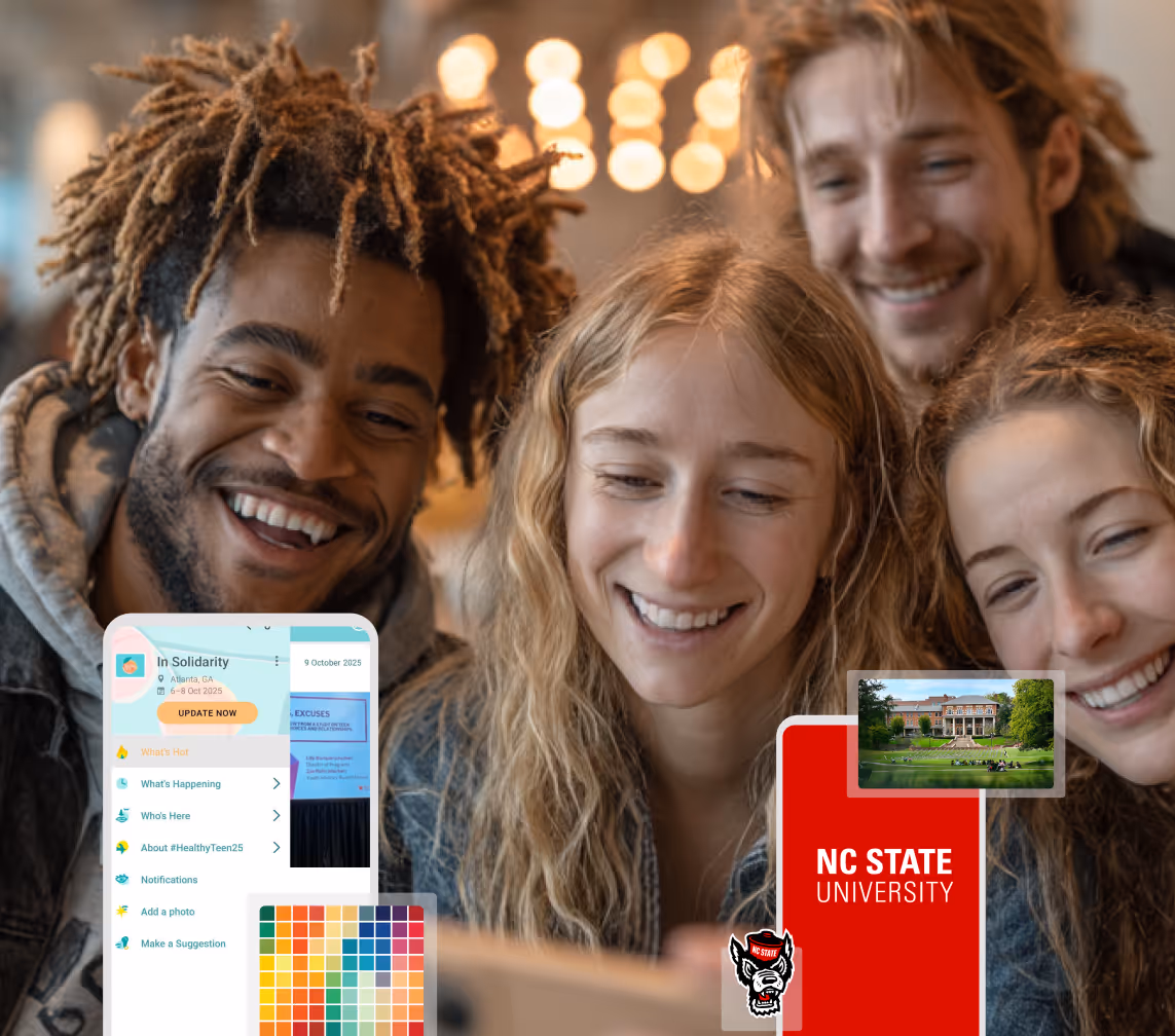
Boost Student Engagement
One hub for schedules, resources, and events that keeps students connected throughout the academic year.
Planning Orientation?
Help new students feel prepared from day one with schedules, campus resources, and real-time updates in one app.
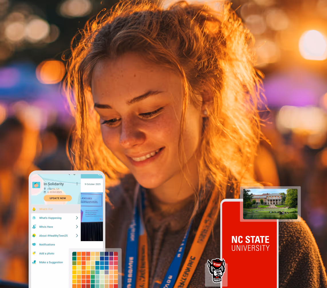
Planning Orientation?
Help new students feel prepared from day one with schedules, campus resources, and real-time updates in one app.
Running Admissions Events?
Manage open houses, tours, and yield events with a branded app that saves time and engages prospective students.

Running Admissions Events?
Manage open houses, tours, and yield events with a branded app that saves time and engages prospective students.
Get a custom Sponsorship Package Template
Stop starting from scratch. Grab free templates that helWe'll build a tailored sponsorship package with suggested pricing, tiers, and benefits..for your specific event.p you build professional sponsorship packages and close deals faster.
Get a custom Sponsorship Package Template
Stop starting from scratch. Grab free templates that helWe'll build a tailored sponsorship package with suggested pricing, tiers, and benefits..for your specific event.p you build professional sponsorship packages and close deals faster.
Plan Your Next Event Without Missing a Beat.
From venue selection to post-event wrap-up, this free checklist walks you through every step (so nothing falls through the cracks).
.avif)
Plan Your Next Event Without Missing a Beat.
From venue selection to post-event wrap-up, this free checklist walks you through every step (so nothing falls through the cracks).
Real Results From Real Events
100,000+ organizations trust Guidebook. See exactly how universities, associations, enterprises, and more put it to work.

Real Results From Real Events
100,000+ organizations trust Guidebook. See exactly how universities, associations, enterprises, and more put it to work.
Flexible pricing for every event size
Find the perfect plan for your needs, from intimate gatherings to large-scale conferences.

Flexible pricing for every event size
Find the perfect plan for your needs, from intimate gatherings to large-scale conferences.
Join our event experts
Watch on-demand webinars and join live sessions with industry leaders sharing best practices for event success.
.avif)
Join our event experts
Watch on-demand webinars and join live sessions with industry leaders sharing best practices for event success.
Guidebook in Action
Book a personalized walkthrough and discover how we help event teams create better attendee experiences.
Guidebook in Action
Book a personalized walkthrough and discover how we help event teams create better attendee experiences.
11 Event Registration Page Examples You Can Learn From
.avif)


11 Event Registration Page Examples You Can Learn From
Your event registration page is the most critical step in converting website visitors into confirmed attendees. Since this page is designed for conversion, the user experience matters significantly.
A poorly structured registration page can lead to confusion, drop-offs, and missed opportunities. On the other hand, a well-optimized page guides users through the process, ultimately increasing registration rates and building anticipation for the event.
In this article, we’ll explore 11 event registration page examples across free, paid and virtual events. You’ll discover what makes them effective and get inspiration for your next registration flow.
Let’s dive in!
11 Event Registration Page Examples: Free, Paid and Virtual
1. AAJA Re[Vision]ing Leader Summit
Event Type: In-person

Hosted by the Asian American Journalists Association (AAJA), Re[Vision]ing is a leaders summit designed to bring together AAPI media leaders to reflect on AAJA’s legacy and reimagine the future of leadership across industries.
The event emphasizes community, personal growth, and inclusive, values-driven leadership during a time of major change in journalism.
Why It Works:
- Clear value proposition that frames the event as purpose-driven.
- Concise, benefit-oriented messaging that highlights growth, community, and inclusivity. Basically leading with why rather than what.
- Clean and streamlined, Guidebook-powered registration page, with easy-to-identify ticket categories.
- The page uses two clearly defined ticket categories and there are logical sub-types (e.g., member vs. non-member), making it easy for users to quickly identify which path applies to them.
Notable Features: The page displays the number of remaining tickets available, which introduces a subtle sense of urgency and scarcity. This helps nudge users toward quicker decision-making while also signaling transparency around capacity.
2. Figma Config San Francisco
Event Type:Virtual/Free and In-Person/Paid
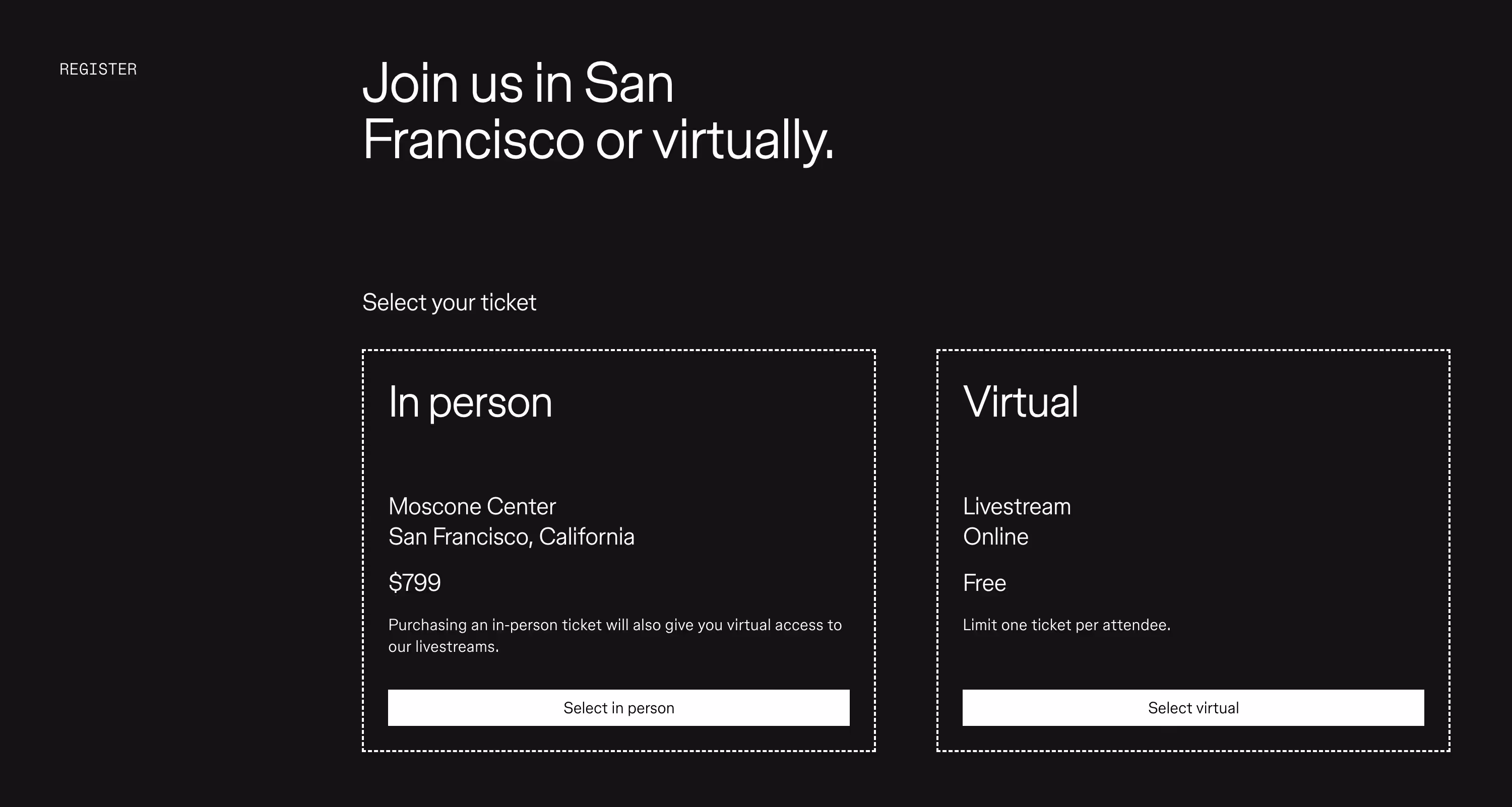
Config is an annual, global design conference that celebrates creativity, collaboration, and the future of design. Organized by Figma - a popular interface design and prototyping platform - the event offers both in-person and virtual attendance options.
Why It Works:
- Two distinct ticket tiers: In Person (which is paid) and Virtual (which is free). This simplicity eliminates decision fatigue for the end user.
- Minimalist interface that removes all distractions and keeps users focused on what’s most important: completing their registration.
Notable Feature: The clean, text-only design offers a refreshing contrast to the visual clutter that sometimes occurs on registration pages.
3. Arnold Sports Festival
Event Type: Paid
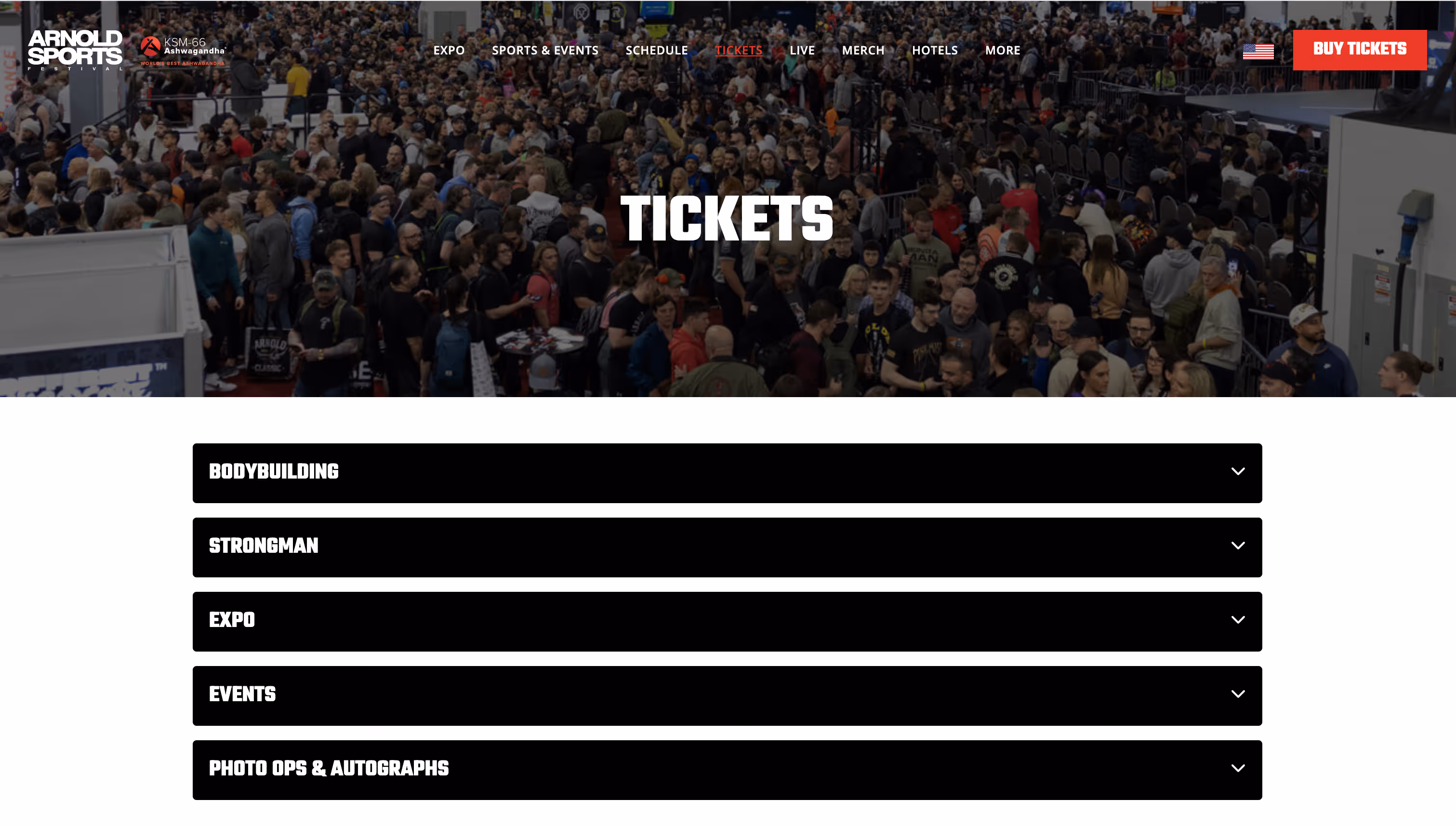
Founded by Arnold Schwarzenegger, the Arnold Sports Festival is one of the biggest fitness exhibitions in the world. The event attracts 100,000+ attendees and 15,000 athletes from around the world, along with sponsorship from major fitness and supplement brands.
Why It Works:
- 5 ticket categories that are easily distinguishable on the page.
- A user-friendly layout that relies on expandable sections to show (or hide) details for each ticket category.
- Each ticket category houses 2 - 12 ticket subcategories that are also organized using expandable sections.
- When users expand a main category, they see only the most relevant information for each ticket subcategory first: price and the Buy button.
- Users can click to view details of what’s included for the specific ticket they’re interested in.
Notable Feature: Given that the festival offers multiple dozens of ticket options, the use of expandable and collapsible sections is a smart choice. It reduces visual clutter and makes it easy for users to focus only on the ticket that they’re interested in.
4. GreenBiz 25
Event Type:Paid and Free (Livestream)
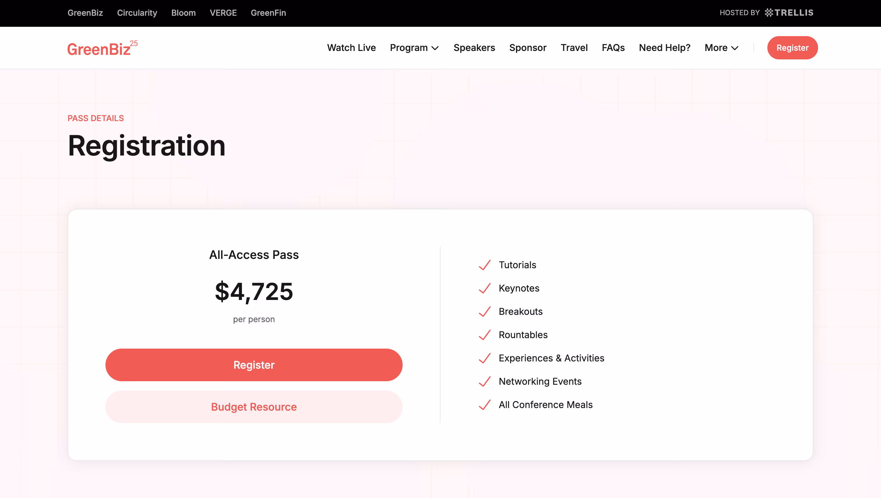
GreenBiz 25 is a conference that aims to help corporate sustainability leaders lead change in the face of political, social and economic uncertainty. Attendees gain insights on key sustainability topics like decarbonization, disclosure and supply chains.
Why It Works:
- Clear presentation of the All-Access Pass and what it includes.
- Further down the page, there’s a Discounts section that lists four options, who they’re for and how to take advantage of them.
- The addition of hotel information - with a special rate - at the bottom of the page provides convenience for attendees who don’t want to spend extra time researching their own accommodation.
Notable Feature: A downloadable Budget Approval Resource helps potential attendees justify the cost by outlining key benefits, cost breakdowns, and networking opportunities. It’s a helpful and practical resource for anyone who needs to get internal approval.
5. AI Summit London
Event Type:Paid
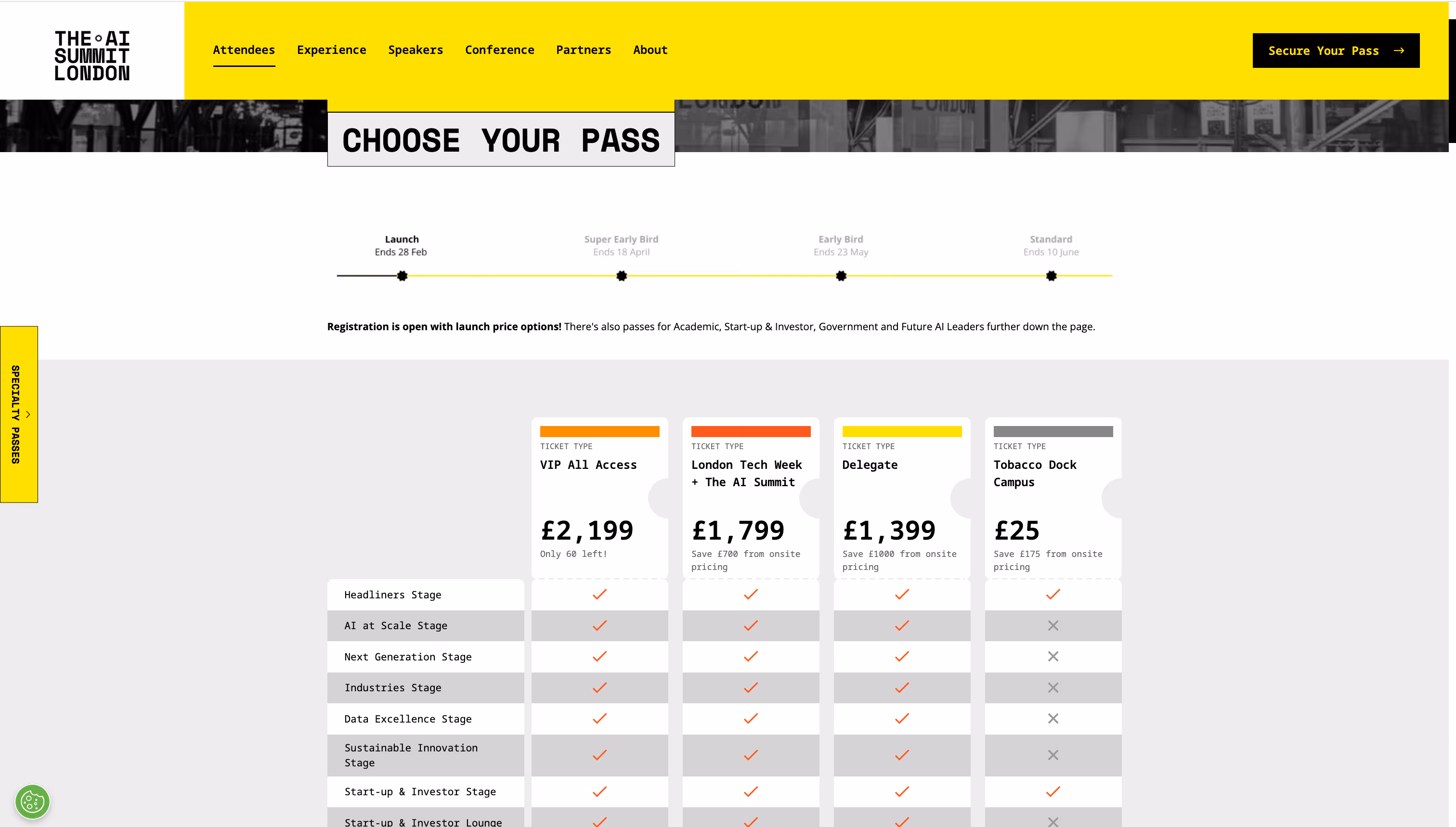
The AI Summit London brings together industry leaders, AI enthusiasts and innovators to explore the practical applications of artificial intelligence. The summit offers a comprehensive agenda with multiple stages, numerous speakers, and immersive features.
Why It Works:
- The pricing table allows future attendees to visually compare the four main ticket types.
- For tickets that are about to sell out, there’s a label indicating how many are left. This creates a sense of urgency and encourages others to register sooner than later.
- A dedicated section at the bottom of the page showcases Specialty Passes that may only be relevant for a niche segment of attendees.
Notable Feature: A timeline at the top of the screen reminds users when early bird tickets and standard tickets will be available.
6. World Tea Expo
Event Type: Paid
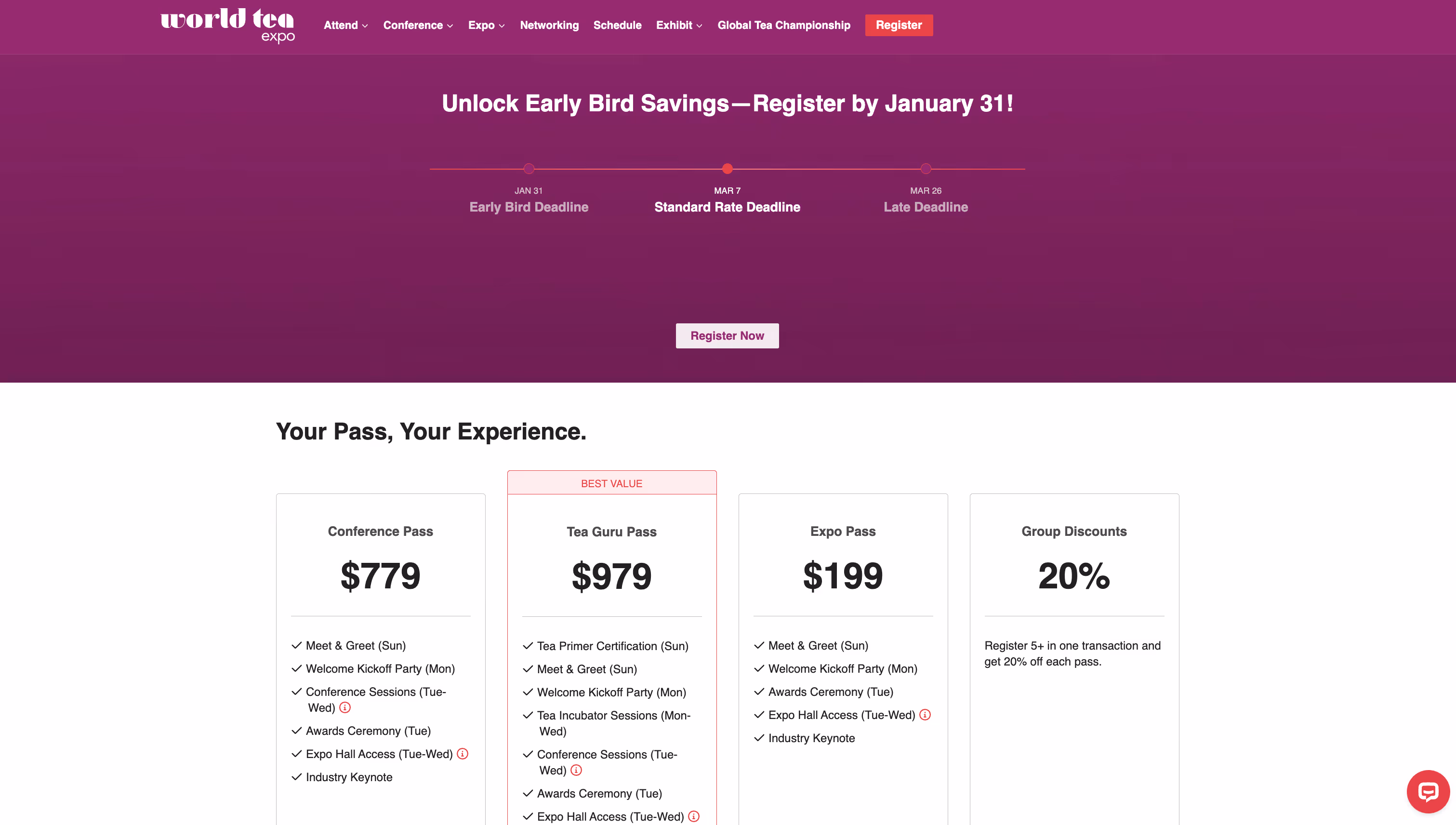
A leading event for tea professionals and enthusiasts, the World Tea Expo explores the latest trends, products, and innovations in the tea industry.
Why It Works:
- A pricing table clearly distinguishes between the four ticket tiers, making it easy for attendees to compare options.
- The “best value” ticket is visually highlighted with red text and a red outline, drawing attention to the best deal.
- Registration deadlines for each ticket type are displayed at the top of the page, ensuring attendees are aware of pricing changes and urgency.
Notable Feature: The FAQ section at the bottom of the page provides additional information on group rates, accommodations and contact information for support.
7. Craft + Commerce
Event Type: Paid
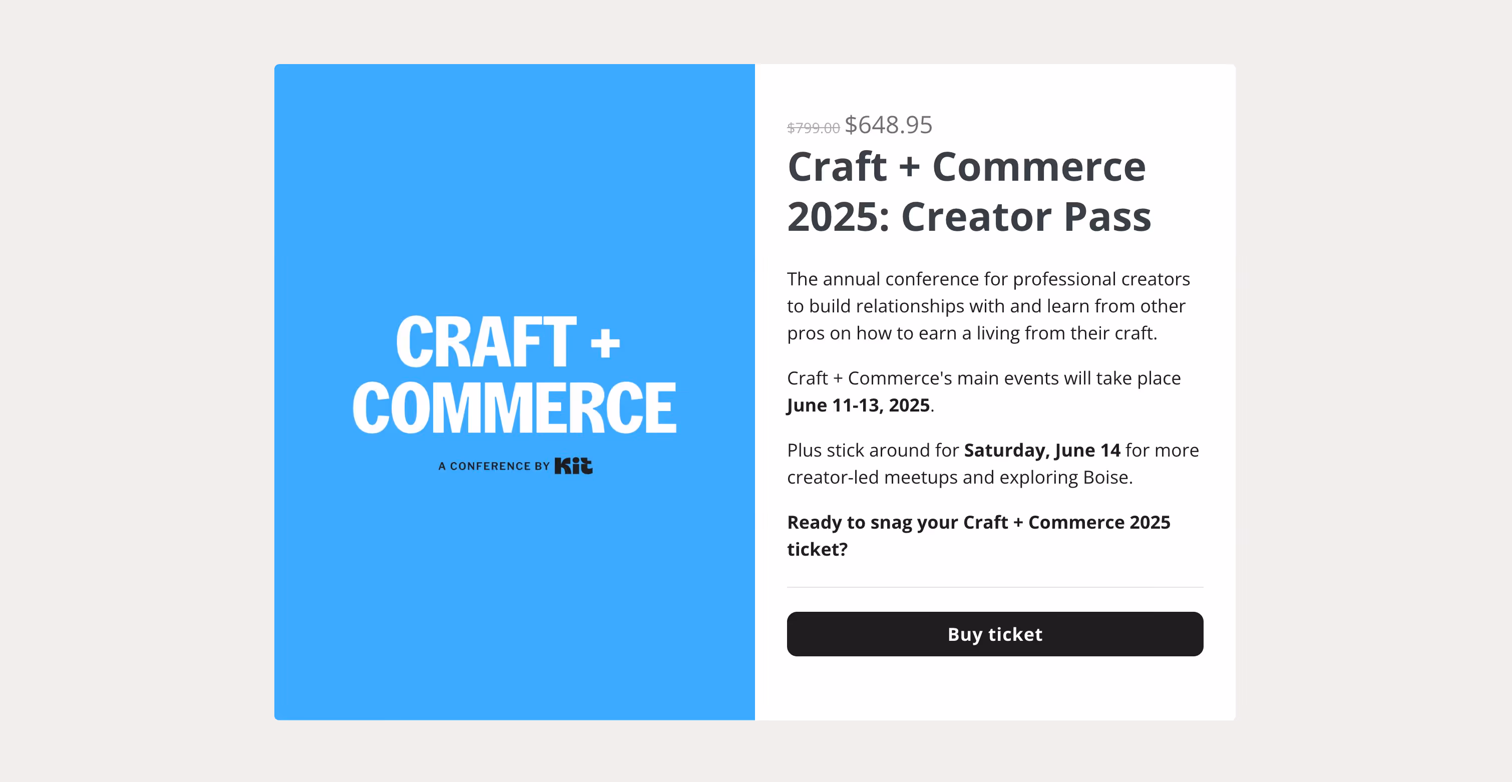
Organized by the email marketing platform Kit (formerly ConvertKit), Craft + Commerce is an annual event for entrepreneurs and creators who want to turn their passion into a profitable business. The platform itself boasts a customer base that includes popular creators like Andrew Huberman, Mark Manson and Tim Ferris.
Why It Works:
- Single ticket type with the price immediately visible at the top of the page.
- Simple split screen design with the event name on the left and the event summary on the right.
- The event dates are highlighted in bold.
- A clear call-to-action: Buy ticket.
Notable Feature: The text-only presentation is refreshing in an age where there’s often a lot of emphasis on images or high concept layouts.
8. Shoptalk
Event Type: Paid and Free

Shoptalk is a retail and e-commerce conference where industry professionals gather to explore innovations and tackle challenges in their field. The event features a diverse agenda with 200+ speakers and 10,000+ attendees.
Why It Works:
- A grid-based layout that clearly showcases each ticket tier.
- The top of the page lists what’s included with all tickets, regardless of the tier. This puts the information in one location for the user and eliminates the need to repeat it in each grid box.
- Clear calls-to-action for paid tickets (“Get Tickets”) and tickets that require approval (“Apply”)
- Dedicated grid box to attract potential sponsors and exhibitors.
Notable Feature: The FREE ticket type - which features prominently on the registration landing page - provides senior retail executives with a fully covered ticket, travel reimbursement, and curated networking meetings. Overall, it’s an attractive and strategic way to bring high-level decision-makers to the event.
9. Creator Economy Live
Event Type: Paid and Free

The Creator Economy Live conference is for brands that want to improve their influencer marketing strategies and explore opportunities in the creator economy. Attendees get tactical sessions led by top voices in the industry, providing tools and techniques to refine their influencer approaches.
Why It Works:
- A pricing table with 3 ticket tiers gives users a quick overview of what’s in each package.
- The use of a dark background provides strong contrast that makes the pricing table easily visible.
Notable Feature: The first 500 brands to register get free access to the event. This is a smart way to drive early signups and strengthen the event’s position in the influencer marketing space.
10. Watches and Wonders
Event Type:Paid

Considered one of the most prestigious events in the watches industry, the Watches and Wonders expo is an opportunity for renowned brands, and independent watchmakers to showcase their craftsmanship. The event features guided tours, panel discussions, and explorations of watchmaking.
Why It Works:
- Easy-to-read grid that highlights four ticket tiers.
- Flexible tickets that give access to one or more days of the event.
Notable Feature: The registration page also highlights new perks for 2025, notably exclusive accommodation rates and free transportation for the public days ticket.
11. Direct Booking Summit
Event Type:Paid
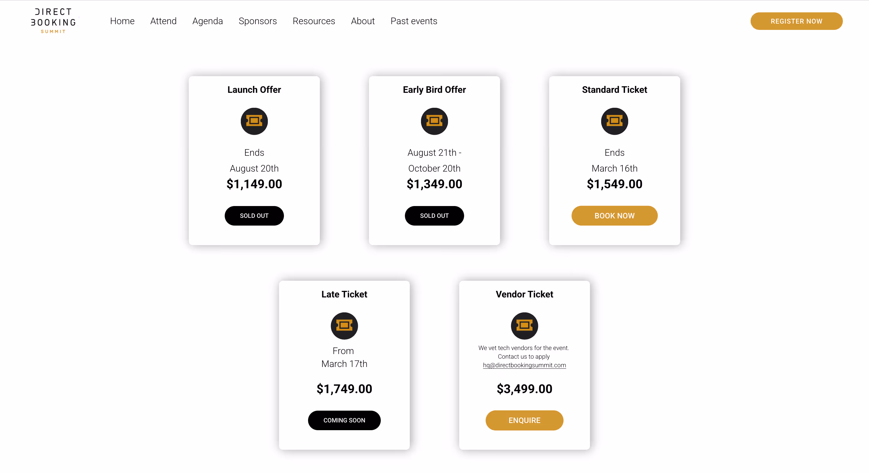
The Direct Booking Summit aims to help hoteliers enhance their direct booking strategies and reduce reliance on third-party platforms. The two-day event offers keynote speeches, panel discussions, interactive workshops, and networking opportunities.
Why It Works:
- Clean design showcases all ticket tiers in an easy-to-read grid.
- A short testimonial from a previous attendee adds credibility and encourages users to register.
Notable Feature: The registration page includes a Vendor Ticket option that is specifically for technology providers, creating opportunities for collaboration between hoteliers and tech innovators.
Key Takeaways for Creating An Event Registration Page
Based on the examples we’ve covered, there are some general characteristics that all effective registration landing pages share. These include:
- Clear and compelling CTAs that encourage immediate action.
- A frictionless registration form that ensures users don’t abandon the process.
- Mobile optimization so that attendees can register on any device.
- Social proof - such as urgency indicators - to boost trust and encourage registration.
- A seamless user experience that keeps visitors engaged from start to finish.
Want more insight on designing a high-converting registration page? Follow these best practices for event registration landing pages.
Tips On What To Include In An Event Registration Form
A well-structured registration form is crucial for capturing attendee details while keeping the sign-up process smooth. The best forms:
- Ask only for essential information to reduce drop-offs.
- Use progress indicators if the form has multiple steps.
- Offer auto-fill options for convenience
- Include clear privacy statements to build trust
To help you provide the best experience for attendees, we’ve put together two resources to help you:
- A quick guide on what to include in an event registration form.
- An overview on event registration survey questions (and 45+ examples!). The survey questions can be included in your registration form or you can send them as a separate, post-registration survey.
Next Steps: Increase Attendance and Simplify Event Planning with Guidebook Registration
A high-converting event registration page removes friction and boosts conversions by combining clear calls-to-action, optimized forms, and a seamless user experience. By taking inspiration from the examples above, you can refine your own registration strategy and create a page that boosts attendance.
Ready to build your own high-converting event registration page? Our event registration platform makes it easy to create a page that drives sign-ups - no coding required. Get started here or book a demo with one of our dedicated product experts.
Plan with Confidence, Not stress
Get the complete event planning checklist with pre-event prep, day-of setup, and post-event follow-up all in one place..