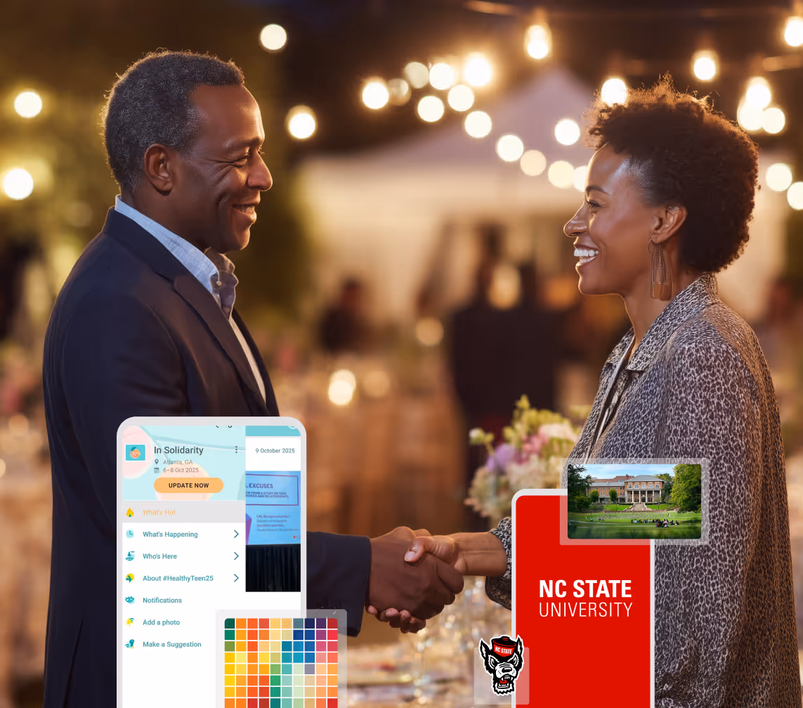
A Smaller School?
Deliver a polished, branded event experience without a large team or a big budget.
A Smaller School?
Deliver a polished, branded event experience without a large team or a big budget.
Running Family Programs?
Give families everything they need, from schedules and maps to real-time updates, all in one place.
Running Family Programs?
Give families everything they need, from schedules and maps to real-time updates, all in one place.
Coordinating Move-In Day?
Share updates, manage events, and keep students informed from move-in through the academic year.

Coordinating Move-In Day?
Share updates, manage events, and keep students informed from move-in through the academic year.
Offering Campus Tours?
Deliver branded, self-guided tour experiences with interactive maps and rich media, available 24/7.

Offering Campus Tours?
Deliver branded, self-guided tour experiences with interactive maps and rich media, available 24/7.
Organising a Career Fair?
Simplify logistics for students, employers, and Career Services staff with one easy-to-use app.
Organising a Career Fair?
Simplify logistics for students, employers, and Career Services staff with one easy-to-use app.
Managing Alumni Events?
Plan reunions, regional events, and fundraising campaigns with an app built for alumni engagement.
Managing Alumni Events?
Plan reunions, regional events, and fundraising campaigns with an app built for alumni engagement.
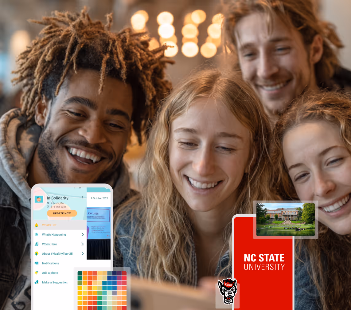
Boost Student Engagement
One hub for schedules, resources, and events that keeps students connected throughout the academic year.
Boost Student Engagement
One hub for schedules, resources, and events that keeps students connected throughout the academic year.
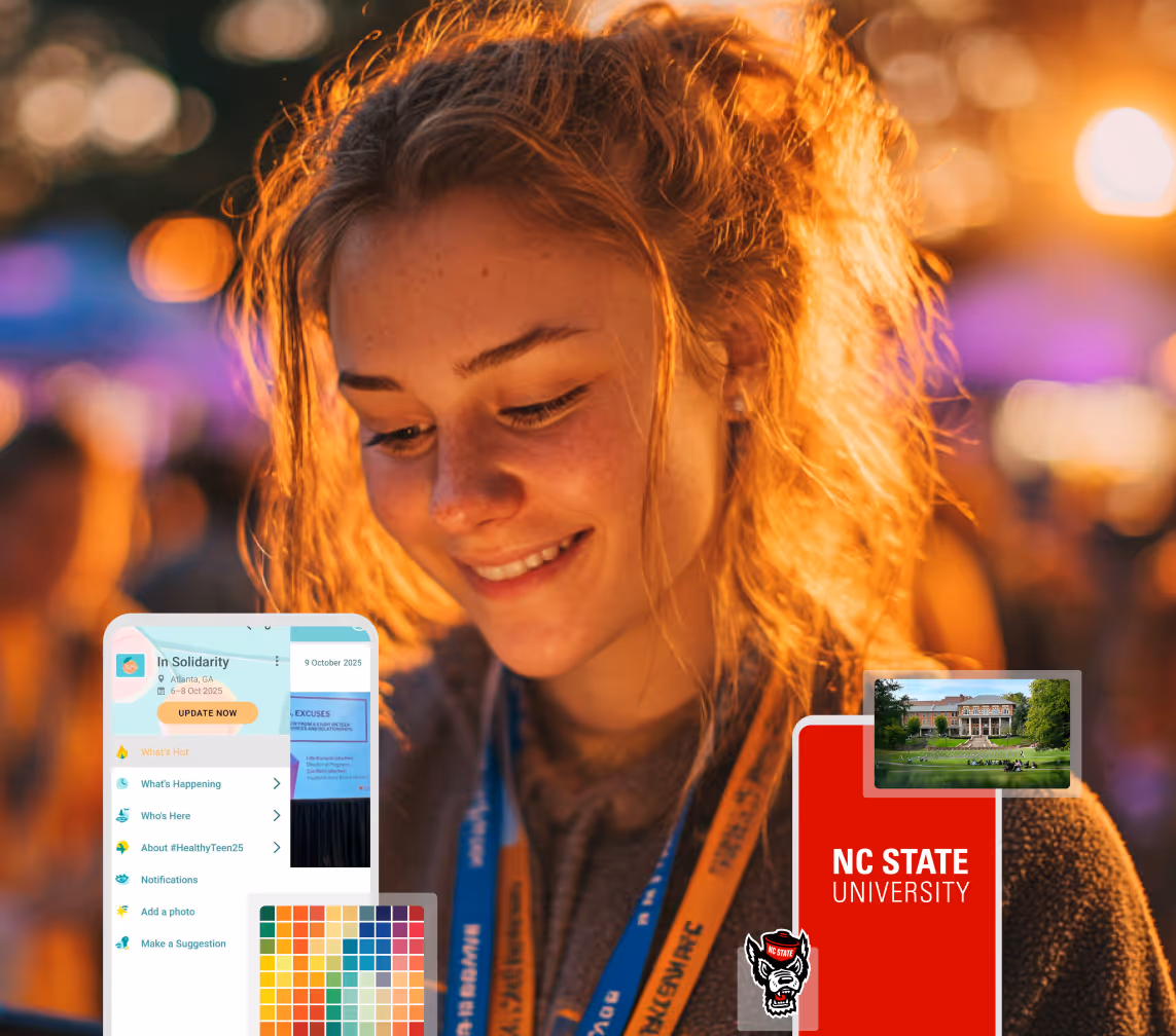
Planning Orientation?
Help new students feel prepared from day one with schedules, campus resources, and real-time updates in one app.
Planning Orientation?
Help new students feel prepared from day one with schedules, campus resources, and real-time updates in one app.
Running Admissions Events?
Manage open houses, tours, and yield events with a branded app that saves time and engages prospective students.

Running Admissions Events?
Manage open houses, tours, and yield events with a branded app that saves time and engages prospective students.
Get a custom Sponsorship Package Template
Stop starting from scratch. Grab free templates that helWe'll build a tailored sponsorship package with suggested pricing, tiers, and benefits..for your specific event.p you build professional sponsorship packages and close deals faster.
Get a custom Sponsorship Package Template
Stop starting from scratch. Grab free templates that helWe'll build a tailored sponsorship package with suggested pricing, tiers, and benefits..for your specific event.p you build professional sponsorship packages and close deals faster.
Plan Your Next Event Without Missing a Beat.
From venue selection to post-event wrap-up, this free checklist walks you through every step (so nothing falls through the cracks).
.avif)
Plan Your Next Event Without Missing a Beat.
From venue selection to post-event wrap-up, this free checklist walks you through every step (so nothing falls through the cracks).
Real Results From Real Events
100,000+ organizations trust Guidebook. See exactly how universities, associations, enterprises, and more put it to work.

Real Results From Real Events
100,000+ organizations trust Guidebook. See exactly how universities, associations, enterprises, and more put it to work.
Flexible pricing for every event size
Find the perfect plan for your needs, from intimate gatherings to large-scale conferences.

Flexible pricing for every event size
Find the perfect plan for your needs, from intimate gatherings to large-scale conferences.
Join our event experts
Watch on-demand webinars and join live sessions with industry leaders sharing best practices for event success.
.avif)
Join our event experts
Watch on-demand webinars and join live sessions with industry leaders sharing best practices for event success.
Guidebook in Action
Book a personalized walkthrough and discover how we help event teams create better attendee experiences.
Guidebook in Action
Book a personalized walkthrough and discover how we help event teams create better attendee experiences.
Event Badge Design Ideas That Make a Big Impact
.avif)


Event Badge Design Ideas That Make a Big Impact
Event badges do a lot of heavy lifting when they’re designed well. They identify, inform, and open doors (literally and figuratively), helping your event run smoothly from the moment attendees check in.
Yet with so many moving pieces to manage (schedules, venues, speakers, food & beverage, and more) it’s easy for badge design to get less attention than it deserves.
In this guide, you’ll learn:
- What makes an effective event badge (beyond just name and logo placement, for example).
- Real-world design ideas that balance clarity, branding, and function.
- Accessibility best practices that ensure badges work for everyone.
- How to tailor badge design based on event size.
- A final checklist to help you catch any issues before sending to print.
Whether you’re printing badges yourself or working with a professional partner, these strategies will help you design with purpose and create a better attendee experience in the process.
Why Thoughtful Badge Design Makes All the Difference
As a planner, you already know badges are non-negotiable. They’re essential for identifying attendees, maintaining security, and organizing check-in.
But what’s often overlooked is just how much badge design impacts the attendee experience, not just in terms of how a badge looks, but also in how it works.
In a fast-paced event environment where attendees are juggling schedules, navigating the venue, and meeting dozens of new people, a badge becomes a functional tool that can:
- Make people feel instantly at ease.
- Help attendees strike up conversations more easily.
- Support accessibility for those with visual impairments.
- Reduce check-in friction for your staff.
- Reflect your brand without interfering with your badge’s core purpose (i.e. all of the above!).
That’s why investing time in a clear, accessible, and purpose-driven badge design pays off in spades. It’s a win-win for attendees, your team, your brand, and the overall event experience.
What Makes an Effective Event Badge?
At its core, an effective event badge should clearly communicate key information at a glance and integrate seamlessly into the flow of the event.
Attendees shouldn’t have to constantly adjust or fiddle with their badge, nor should they have to squint to read it, or guess which details are most important. Ideally, the badge should fade into the background (in the best possible way) as it quietly supports connection, wayfinding, and a fluid attendee experience overall.
While every event is different, the most effective event badges share a few key traits, as listed below.
They’re easy to read at a glance
Names should be legible from arm’s length, even in dim lighting or crowded spaces. Clear typography and strong contrast make it easier for attendees to recognize one another without awkward pauses or squinting.
They have clear information hierarchy
While every detail on a badge may feel important, not all information deserves equal weight. The attendee’s name should always be the most prominent element: large, legible, and unmissable.
Secondary details like role, organization, or access level should still be visible, but shown with less visual weight. This gives each element room to breathe so nothing gets lost in the mix.
They’re designed with purpose, not just for looks
Because badges are meant to be functional, including too much text, too many logos, or overly complex design elements can create visual noise and take away from the overall experience. So, it’s best to stick with a clean, intentional design that prioritizes clarity and usefulness.
They support how your event actually operates
This might seem obvious, but event badges should be designed to work with how your event runs — whether that means quick check-in, session scanning, lead retrieval, or security checks. When badges are built with operations in mind, they reduce friction and help your event run more smoothly from start to finish.
They’re designed for the full attendee experience
Attendees (and staff) will wear, look at, touch, and interact with badges all day long. So beyond thinking about what to include on the badge, it’s worth considering how the badge will feel throughout the event.
That includes how it hangs, whether it flips when worn, where it sits on the body, and how comfortable it is for attendees moving through a busy space.
Accessibility matters here, too. Is the font large enough to read from a few feet away? Is the contrast high enough to be seen in different lighting? Can the QR code be scanned easily without making multiple attempts?
Designing with the attendee experience in mind means minimizing friction at every touchpoint, whether that’s at check-in, or in networking areas.
Event Badge Design Ideas That Actually Work
Now that we’ve covered the fundamentals of what makes an effective badge, let’s look at some specific design ideas that consistently deliver, both in terms of function and attendee experience. From minimalist layouts to color-coded roles and QR-friendly formats, these examples can help you design badges that feel intentional, on-brand, and easy to use.
1. Use a minimalist layout that spotlights attendees’ names
A minimalist badge design puts the attendee’s name front and center, with large, readable font and ample spacing around it. Add in a couple of supporting details, like title or company, and avoid cramming in too much information.
This type of layout works especially well for:
- Networking-heavy events.
- Corporate conferences.
- Executive audiences.
It removes distractions and lets people connect without squinting.
2. Use color-coded badge variations for roles or tracks
Color coding is a simple and effective way to distinguish between attendee types and communicate roles. For example, you can use:
- Blue for general attendees.
- Green for speakers.
- Red for staff.
- Yellow for VIPs.
Color-coding can also be useful for multi-track events or multi-campus university orientations where attendees belong to different sessions or groups.
Just be sure to back up colors with text labels or icons for accessibility because everyone doesn’t perceive color the same way.
3. Add a QR code in a spot that’s easy to scan
A QR code can unlock a ton of functionality like fast check-in, lead capture, access control, or digital schedules — but only if it's easy to scan.
To ensure smooth sailing during your event, here are some best practices for QR code placement:
- Keep the code on the bottom half of the badge, away from the lanyard hook.
- Avoid putting it too close to the edge where it might get cropped.
- Make sure it’s large enough to scan from a short distance without fumbling.
Some planners even add a secondary QR code on the back of the badge for added convenience.
4. Choose badge material that fits your event style
The material you use for a badge affects both lifespan, as well as how it feels to attendees.
For single-day events, a sturdy cardstock is often sufficient. For multi-day conferences or outdoor events, plastic or PVC badges hold up better against wear and tear.
Choosing the right material also reinforces your brand and sets expectations. For example:
- Heavy, matte cardstock feels intentional and understated. It’s a great fit for thoughtful, eco‑conscious events or smaller, design‑forward gatherings.
- Glossy plastic signals something more polished and high‑production, often used for large conferences or premium experiences where durability matters.
- Laminated stock strikes a comfortable middle ground, offering a clean look with added durability without feeling overly formal.
Whatever material you choose, it’s worth doing a test print to make sure names, photos, and QR codes stay crisp and easy to scan throughout the day.
5. Print helpful info on the back of the badge
The back of a badge is prime real estate, so take advantage of it. While the front should stay focused and readable, the back can carry secondary, high-value information like:
- Wi-Fi login credentials.
- Emergency contact numbers or help desk locations.
- A QR code linking to your event app or feedback form.
- A simplified map of the venue or session zones (this is a nice complement to the detailed, interactive map that’s in your event app).
Using the back of the badge for reference information gives attendees quick access to what they need (without overwhelming your staff with repetitive questions), making the entire event feel smooth.
6. Incorporate branding without overcrowding the badge
Your badge is an extension of your event brand, but when too many design elements compete for space, it quickly becomes cluttered and harder to read. The goal is to make the badge feel like part of the experience without distracting from the essential attendee information.
Here are a few ways to integrate branding cleanly:
- Place logos and visual elements in low-traffic areas, like the header or footer, where they won't interfere with the attendee's name or QR code.
- Use your brand color palette subtly, as background shading, accent lines, or borders.
- Use your brand font, as long as it holds up at badge size and is readable from a distance. If your font is too decorative or hard to read at a glance, choose an alternative (especially for essential info like name and roles).
- Avoid layering sponsor logos or design flourishes near attendee details, especially names, roles, or access levels.
At the end of the day, the badge should reflect your event’s identity, but never at the cost of clarity or ease of use. Design with intention, and keep the attendee experience front and center.
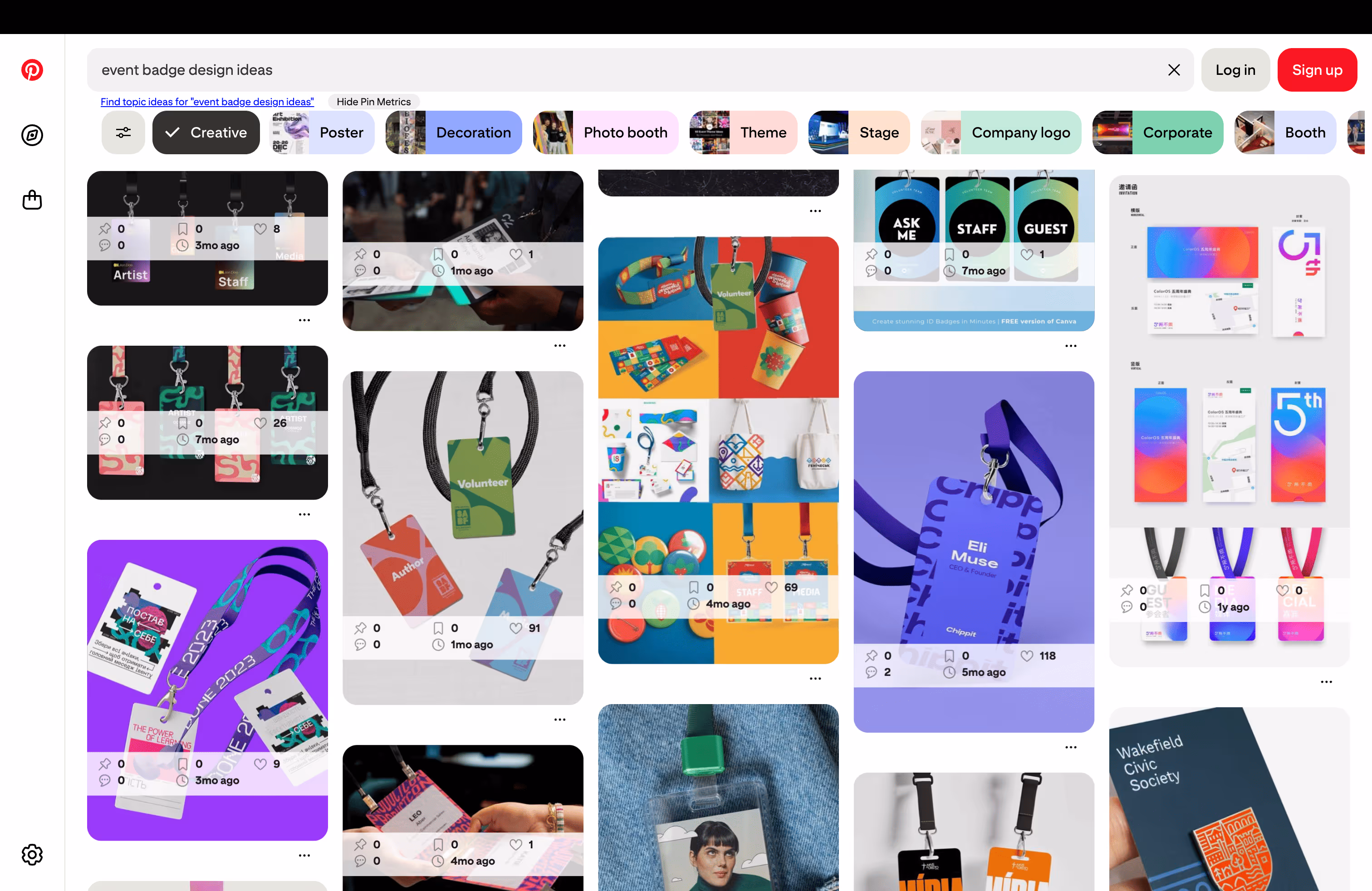
7. Look at real-world badge examples for inspiration
Designing a badge from scratch can be tricky, so don’t! One of the best ways to get inspired is to see how others in the event world approach it.
You can start with a quick search on Pinterest for “event badge design ideas” and you’ll instantly find a variety of creative layouts, color treatments, and clever details worth exploring.
In addition, our professional printing partner, Billy’s Badges, regularly shares trends and inspiration on their blog. One example is a recent post on using metallic inks to elevate badges with subtle shimmer and a premium look — perfect for VIPs, brand moments, or simply making your event stand out.
Event Badge Design Checklist
Before you send anything to print, it’s always a good idea to give your design a final gut check. This simple badge design checklist helps ensure everything is clear, functional, and attendee-friendly.
Accessibility Best Practices for Badge Design
Once your layout is in place, the next step is to make sure your badge works for everyone. Designing with accessibility in mind helps all attendees, whether they have low vision, or simply want to avoid squinting at a name tag.
These small, thoughtful decisions not only improve clarity, they also reduce friction across the entire attendee journey.
Use high-contrast colors
Poor color contrast is one of the most common accessibility issues, so to make text easier to read:
- Avoid placing light text on light backgrounds or dark on dark.
- Stick to black or dark gray text on white or very light backgrounds for maximum legibility.
- Use your brand colors as accents rather than backgrounds, unless they pass WCAG 2.1 color contrast guidelines.
Choose fonts for clarity, not just aesthetics
Fancy, stylized fonts may look great in a brochure, but they’re not always the best choice for a badge. Instead:
- Use simple sans-serif fonts (like Arial, Helvetica, or Roboto) that are clean and easy to read.
- Avoid overly decorative, narrow, cursive or italicized fonts.
- Stick to 14pt+ for secondary info, and 20pt+ for names if possible.
- Use ample line spacing to avoid crowding information.
As mentioned in the previous section on effective badges, use your brand font if it’s readable and holds up at badge size. Otherwise, choose an accessible alternative just for badges (your attendees will thank you!).
Make It legible from a distance
To improve the readability of your badge:
- Make sure names are large enough to be read from a few feet away.
- Avoid shrinking text in order to accommodate logos or decorative elements.
- Combine font size and weight to shine the spotlight on key information
All of the above will make things easier during networking, panel Q&As, and any other time when knowing who’s who matters most.
Leave room for lanyards and holders
Attendees often wear badges in plastic holders, clipped to lanyards, or even retractable reels. Accessibility means avoiding designs that get covered or folded by those formats.
Here are some best practices to keep in mind:
- Don’t put text or QR codes too close to the top edge.
- Leave buffer space so that key information isn’t cut off.
- Test your design with the actual badge holders or lanyards you’ll be using.
Design for scannability
As QR codes and barcodes become standard elements of a badge, it’s important that the badge design makes them easily accessible. Keep the following tips in mind when designing your badges:
- Make QR codes at least 1” x 1” (2.5 cm) in size.
- Ensure strong color contrast with the background (dark code on light background).
- Keep the surrounding space clear (no logos or other text in close proximity).
- Avoid placing codes near folds, lanyard holes, or clip zones.
Use icons and labels together
If you're using icons (for accessibility levels, dietary restrictions, or attendee type), pair them with text labels. Relying solely on visual cues may not be effective for color-blind or neurodiverse users.
For example, instead of just a leaf icon to represent “Vegetarian”, put them side by side:
🌿 Vegetarian
Or instead of a star to represent “Speaker”, try:
⭐ Speaker
Badge Design Ideas by Event Size
Whether you’re hosting an intimate leadership retreat or a bustling multi-day conference, your badge design should reflect the unique pace, format, and flow of the event itself. Below are some adaptable design ideas organized by event size and style, to help you choose what fits your experience best.
For Small, Intimate Events (Fewer Than 100 Attendees)
Smaller events like workshops, offsites, or advisory summits offer a unique opportunity to make each badge feel personal.
Badge design tips:
- Highlight first names in large type — to foster quick, casual introductions.
- Use full names + pronouns to show thoughtfulness and inclusion.
- Include role or department (e.g., “Product – Guidebook”) to encourage cross-functional conversations.
- Consider handwritten touches like pre-written icebreakers or fun facts.
Since the attendee count is low, you can afford a bit more personality in the layout, without sacrificing clarity.
For Mid-Sized Events (100–500 Attendees)
This is where form and function must work hand-in-hand. With more foot traffic and a mix of structured sessions and networking, your badges need to scale smoothly.
Badge design tips:
- Color-code by track or attendee type (e.g., Speaker, Sponsor, Guest) to help staff and guests navigate more easily.
- Add QR codes for check-in or session scanning, making sure to keep them large and scannable.
- Include basic branding elements, like your logo in the footer or use color-coded backgrounds to reflect your brand palette.
- Stick to 2–3 pieces of core information, like Name, Organization, Role to avoid overcrowding the badge.
For Large Conferences (500+ Attendees)
At this size, badge design becomes critical for logistics as you’re dealing with longer lines, more scanning, and an overall need for highly efficient badges.
Badge design tips:
- Use bold, high-contrast name displays for easy recognition across a room.
- Prioritize simplicity in your layout; leave off less critical details if they clutter the badge.
- Use durable materials that won’t crumple or fade easily (especially for events that last several days).
- Place QR codes lower on the badge to avoid interference with lanyards and enable easier scanning at access points.
- Consider double-sided badges, with essentials on the front and secondary info (like Wi-Fi or emergency contact info) on the back.
For more tips and strategies to streamline events of every size, use this guide on smart check-in layouts to manage attendee flow and reduce wait times.
Event Badge Design FAQs
[faq]
Q: What information should be included on an event badge?
A: At a minimum an event badge should include attendee name, role/title, and organization. You should also consider including access level indicators (like “VIP,” “Speaker,” or “Exhibitor”), and a QR code for full event or session access.
On the back of the badge, planners often include wifi credentials, a help desk phone number, or even a simplified venue map for quick reference. And for added inclusivity and functionality, small icons or labels can indicate dietary preferences, accessibility needs, or badge scan permissions.
Q: What is the best size for an event badge?
A: Standard sizes range from 3”x4” to 4”x6”. The smaller end of the spectrum works well for minimalist designs or single-day events, while larger formats provide more room for additional details like QR codes, job titles, or multi-day schedules.
Q: How can I make event badges easier to read?
A: To ensure badge clarity:
- Use clear information hierarchy, where the attendee’s name is the most prominent element, followed by smaller secondary details like title or organization.
- Prioritize high-contrast color combinations, such as dark text on a light background (or vice versa), to make text legible from several feet away.
- Avoid clutter by limiting the amount of text and logos on the front, and giving each element space to breathe.
- Leave buffer space around the top edge and clip zones, so names or QR codes don’t get obscured when the badge is worn.
Q: Can I design and print badges myself?
A: Yes, definitely! If you're using a platform like Guidebook, you can create badge layouts directly within the platform and export them as print-ready PDFs. This makes it easy to print the badges yourself, or with our pro printing partner, Billy Badges.
Q: What materials are best for event badges?
A: That depends on your event style. Heavy cardstock is eco-friendly, glossy plastic looks premium, and laminated badges are versatile and durable. Regardless of which you choose, always test a few samples to ensure text stays crisp, QR codes scan reliably, and the badge can handle real-world use throughout your event.
Q: How do I incorporate sponsor logos without cluttering an event badge?
A: To integrate sponsor logos cleanly use discreet placements like the bottom footer, back of the badge, or along a narrow header band that doesn’t interfere with attendee details. If you’re working with multiple sponsors, your best bet is to showcase those sponsors in your event app instead. This keeps your badge clutter-free and provides a stronger ROI for sponsors. Plus, with app sponsorship, you can generate more revenue and even cover the cost of your event app.
[/faq]
Final Thoughts on Event Badge Design
A thoughtfully designed badge helps attendees connect, navigate, and feel comfortable from the moment they arrive.
The best part? You don’t need to be a designer to create a great one. With Guidebook’s badge design tools, you can build professional-looking badges that are aligned with your brand and ready for print — whether you’re going the DIY route or working with one of our printing partners.
So as you plan your next event, give your badges the same thoughtful attention you give to your agenda, venue, or app. Because when your badges work, your whole event runs better.
Plan with Confidence, Not stress
Get the complete event planning checklist with pre-event prep, day-of setup, and post-event follow-up all in one place..